This is an ingenious way to address issues with gestures overlapping.
It's no secret that people have frustrations with Android 10's gesture navigation, particularly the back gesture — and phones with curved screen edges have only exacerbated the problem. Apps that rely on slide-in drawers can be really tough to use, and when that's a core part of the interface it can slow you down dramatically.
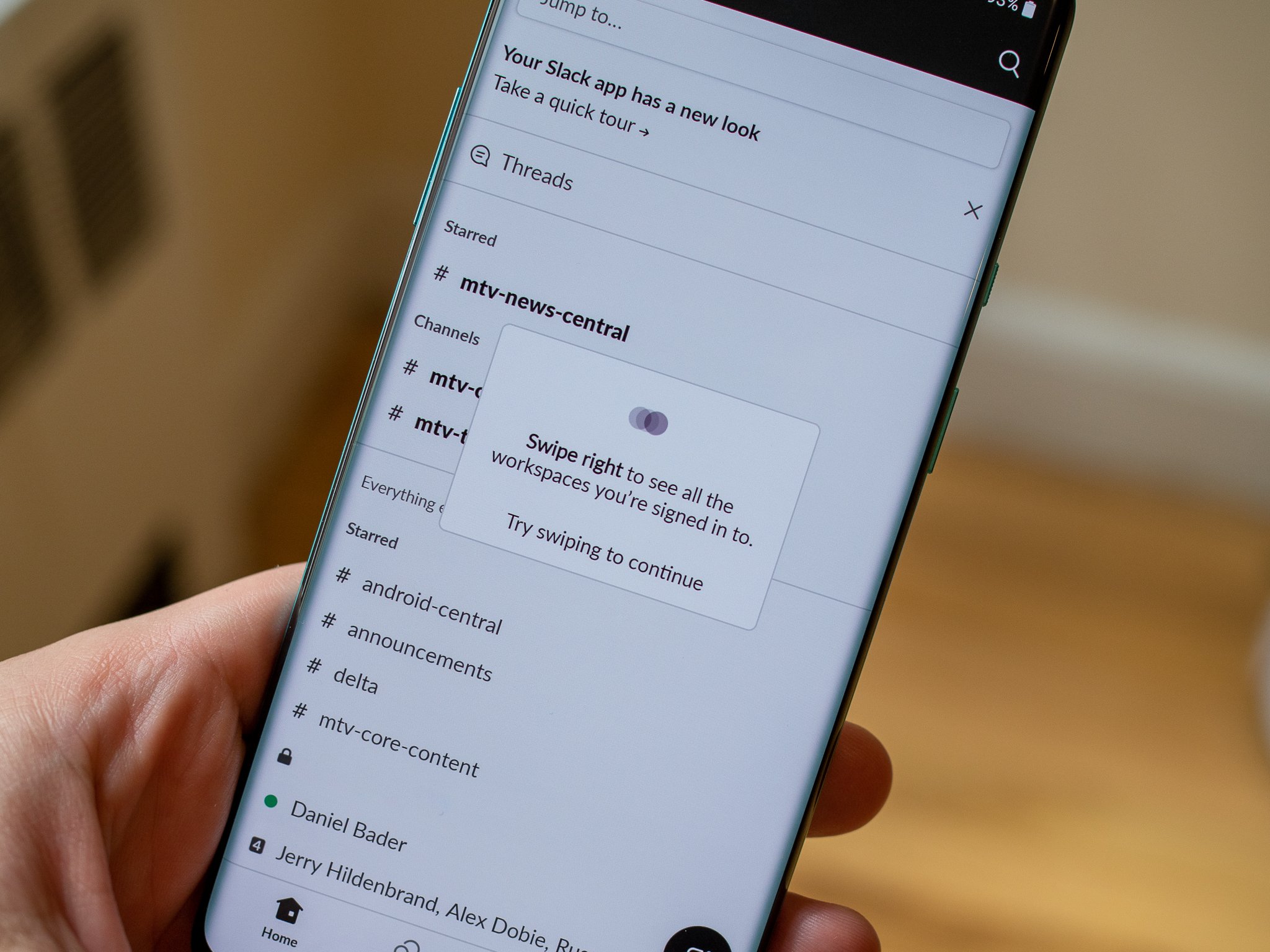
But this week, I received a much-needed ray of hope for this system in the form of an app update. Slack, which previously had one of the worst collisions with gestures and curved screens, has redesigned its app to address both — and it's a wonderful change that every Android app developer needs to study and implement.
Android 10's gestures don't have to be frustrating — we just need fresh app designs.
Slack used to, like many apps, rely on a slide-in drawer for switching contexts inside the app. In the case of Slack, it was to change between channels, groups, threads and messages — something you do several (or dozens of) times each app session. With Android 10 gestures enabled, this required a precise angled edge swipe to pull in the drawer rather than generate a back gesture. But Slack was particularly frustrating because every view you ever had in the app also vertically scrolled. So you couldn't swipe horizontally in from the side, which triggers a back gesture, and you also couldn't swipe too vertically, which gets picked up by the interface as a vertical scroll. You had to perfectly hit the right 45-degree angle to use the slide-in drawer — and, well, it was basically impossible.
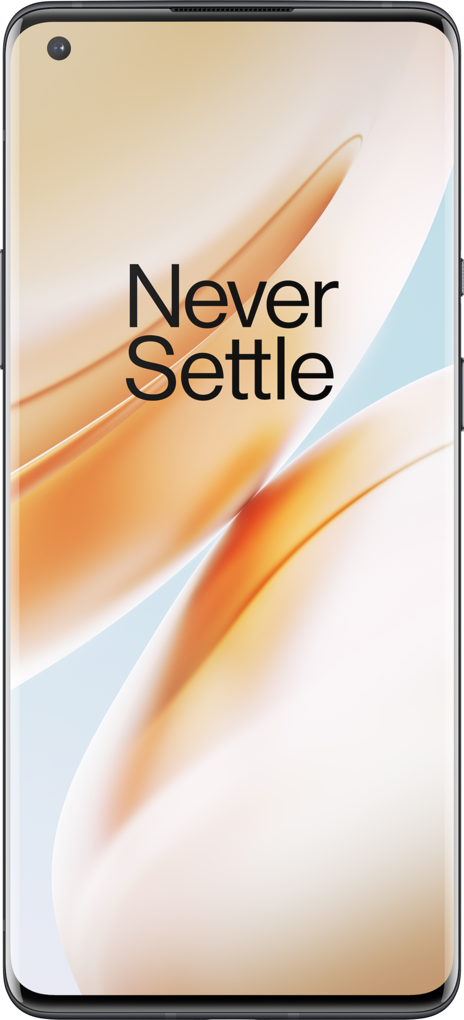
It was so bad on some phones that Slack ended up being really annoying to use. The OnePlus 8 Pro is a perfect example — because of its sharply-curved sides and large size, it was legitimately impossible to open the slide-in drawer with a gesture one-handed. In order to use Slack on my 8 Pro, I had to use two hands so I could tap the top-left corner of the interface to open the drawer. And considering how often you need to switch between channels in slack, this was a massive pain.
Then, my frustration was completely alleviated. After getting over the initial 3-minute shock of "everything is different and I hate it!" when the new Slack design arrived, I knew it had hit on something amazing.
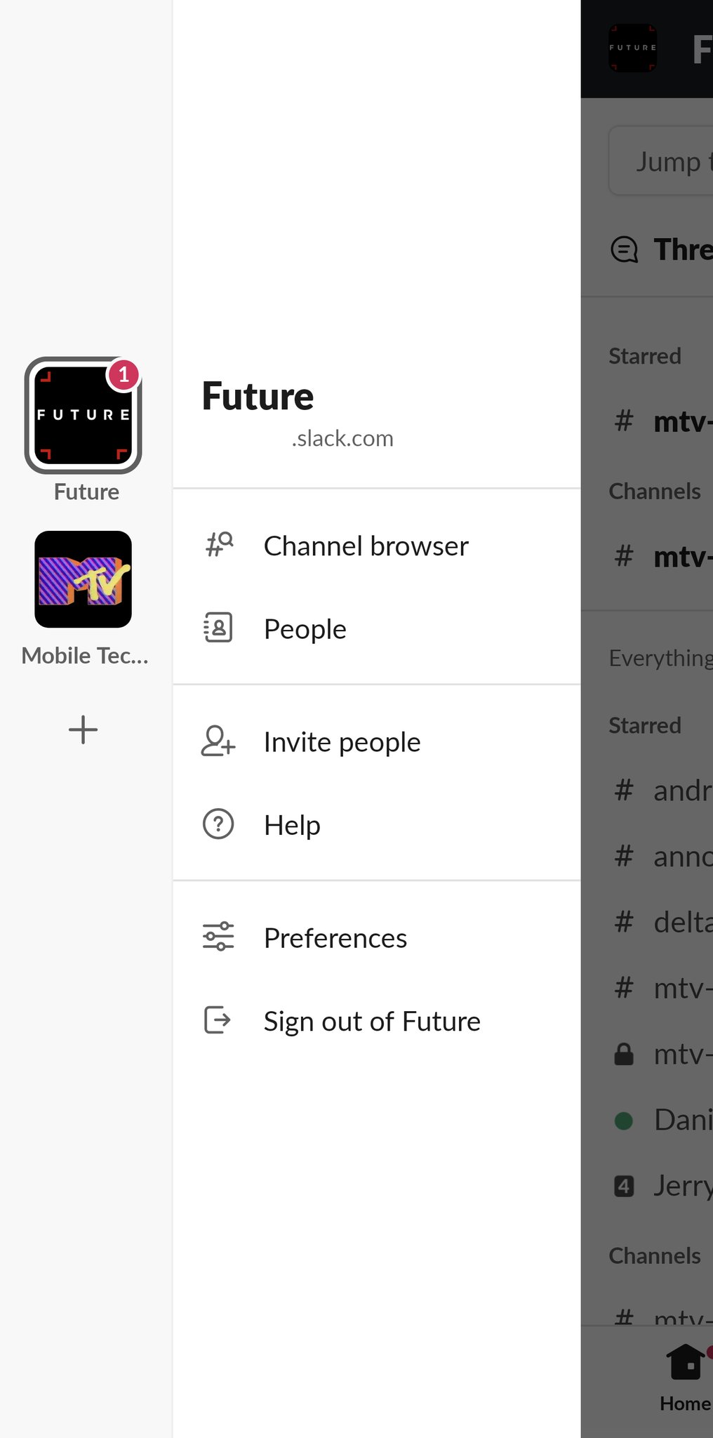
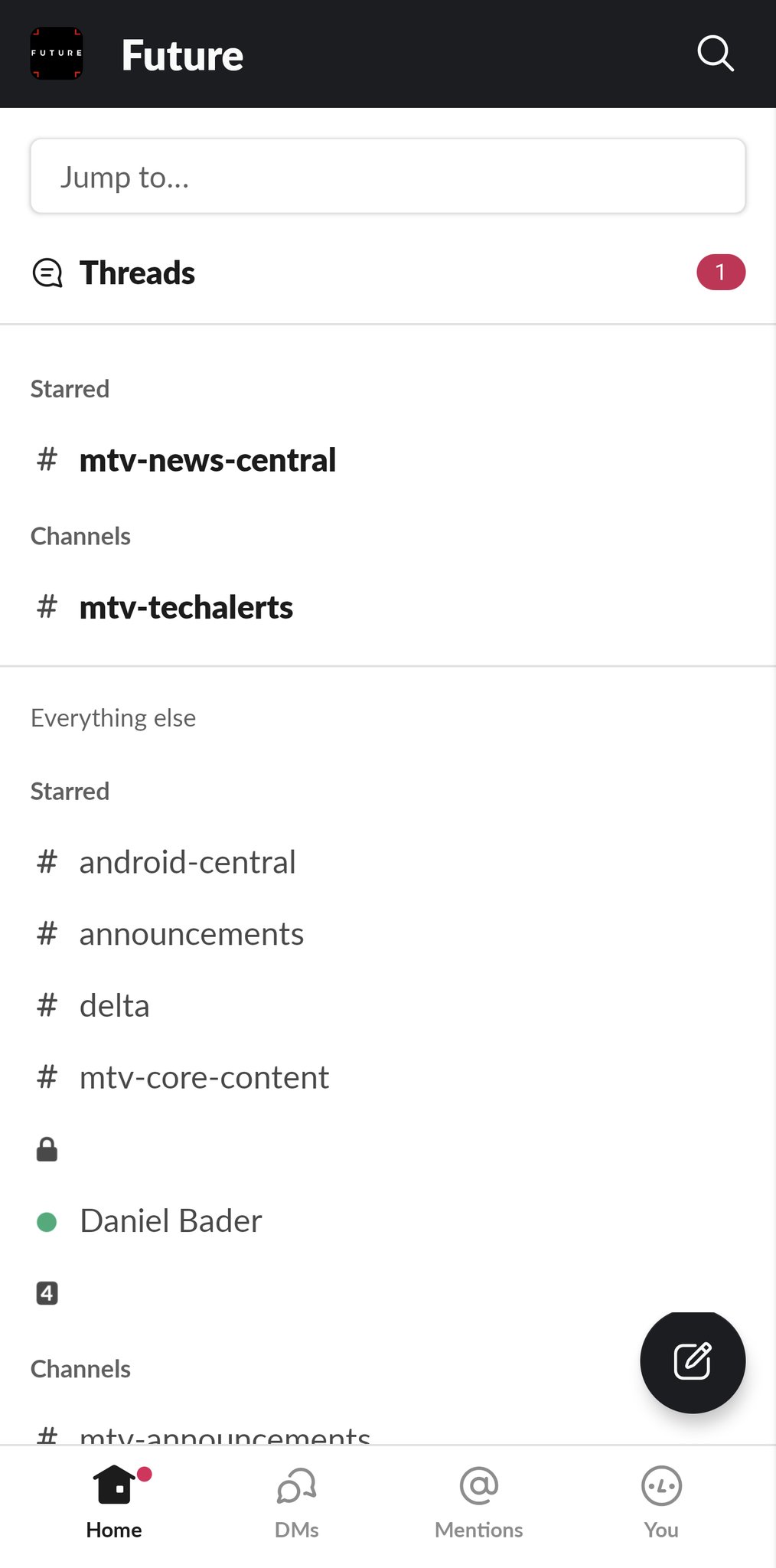
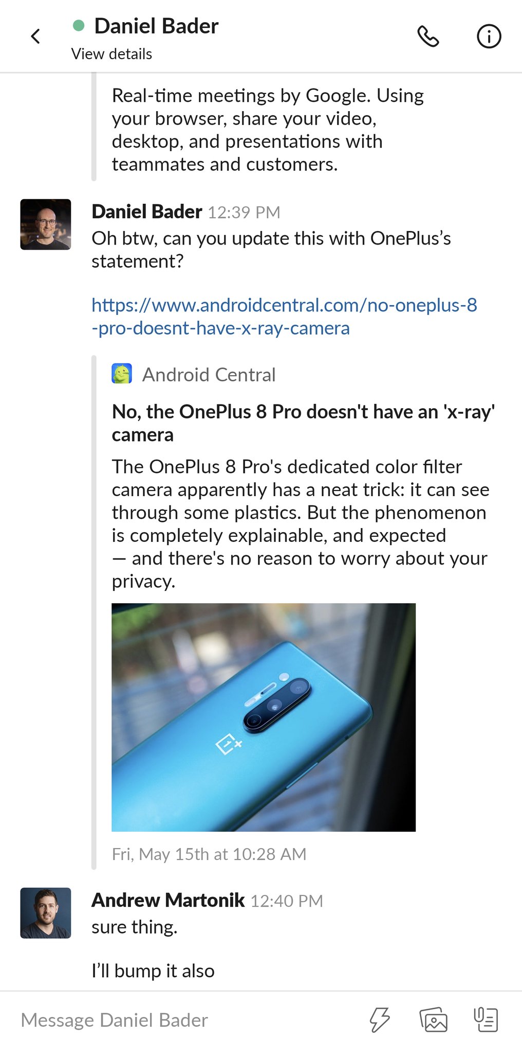
The app switched to a simple horizontal three-pane view: the primary pane is a list of channels and chats, on the left is your different Slack workspaces, and on the right is your current channel or chat. Critically, you swipe across the middle of the screen to move between the three panes — never from the edge, and never at an angle or vertically. So you can switch contexts without using a gesture that can interfere with another one — whether it's system-level or app-level.
Slack's interface would work perfectly for just about any messaging or vertically-scrolling app.
It works beautifully. And it's something that more Android developers need to consider for their own apps. The Android Developers team has a lot of good documentation on various ways to handle gesture conflicts, because there's obviously no one-size-fits-all solution. But Slack's is so simple and elegant, with no overlap or advanced learning curve, that it could easily be deployed in any sort of messaging platform or something that relies on vertically scrolling information panes.
Of course I had never thought about this as a solution, but then again I'm not in any position to redesign Android apps; I can just amplify examples of great design. Slack was able to figure it out, and I hope that many other apps do — because there are still tons of situations in which I'm unable to use an app because I also use Android's gesture navigation, and that should never be the case.
Flagship for less
OnePlus 8 Pro
OnePlus finally made a proper flagship.
After years of "flagship killers, OnePlus has finally made itself a flagship with all the features we expected — wireless charging, water resistance, a beautiful 120Hz screen — and while no phone is perfect, the OnePlus 8 Pro has excellent performance and even better battery life.
Tidak ada komentar:
Posting Komentar