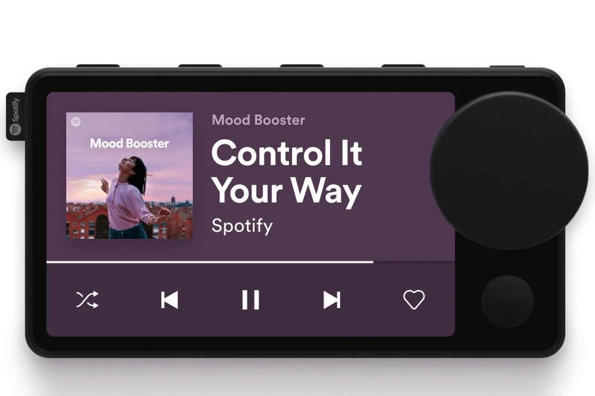
Spotify's weird Car Thing is still kind of weird.
What you need to know
- A new look at Spotify's Car Thing show a large display and large knob.
- An earlier look at the device shows a much smaller, circular display.
- It's not entirely clear how Spotify plans to differentiate the device from other car infotainment systems.
Spotify is not a hardware company, nor does it seem to want to be. The company does well enough as one of the best music players on Android and is dedicated to offering a complete listening experience for its subscribers. As it turns out, hardware might actually be one of the ways the company can do this, and while the company has teased a hardware device in the past, a new look at the "Car Thing" shows that the company has been busy tweaking its design.
Some images of the device have cropped up, apparently appearing within Spotify's iOS app. The Car Thing resembles a car infotainment system with a large knob and a small button on its face and several buttons on top of the device. Apparently, the device can be mounted to a car vent using a variety of mounts.
I imagine the knob on Spotify's Car Thing is for volume and it looks like your phone connects to both Car Thing and your car's audio via BT. I wonder if Car Thing could show directions as well. pic.twitter.com/1pDq1HMFwI
— Steve Moser (@SteveMoser) April 2, 2021
According to the diagrams, a user's smartphone will connect to both the Car Thing and the vehicle using Bluetooth, and it seems like Car Thing will essentially be a way to control your tunes. It's unclear if there will be any significant functionality beyond this. Still, this design makes it appear more like an alternative to in-car systems like Android Auto, perhaps for vehicles that don't have them. According to MacRumors, the FCC filing for the device states that it can communicate with in-car systems, and describes it as a "voice-controlled accessory for phone/Spotify App with supporting display and buttons."
When Car Thing was first announced in 2019, it was teased as a mostly experimental way to test how listeners consume audio in their vehicles. It was shown off with a very different design, featuring a small, circular display and odd buttons. Spotify made the device available to a small group of premium users in the US in a very limited test, and it could be that the new design is a result of those tests.
For now, it's unclear if this device is being seeded to testers or not. The function of the various buttons is also in question, particularly the big knob, which may be some form of volume control. Spotify has made it clear that they weren't gearing up for a hardware launch, but the huge design tweak suggests otherwise.


Tidak ada komentar:
Posting Komentar