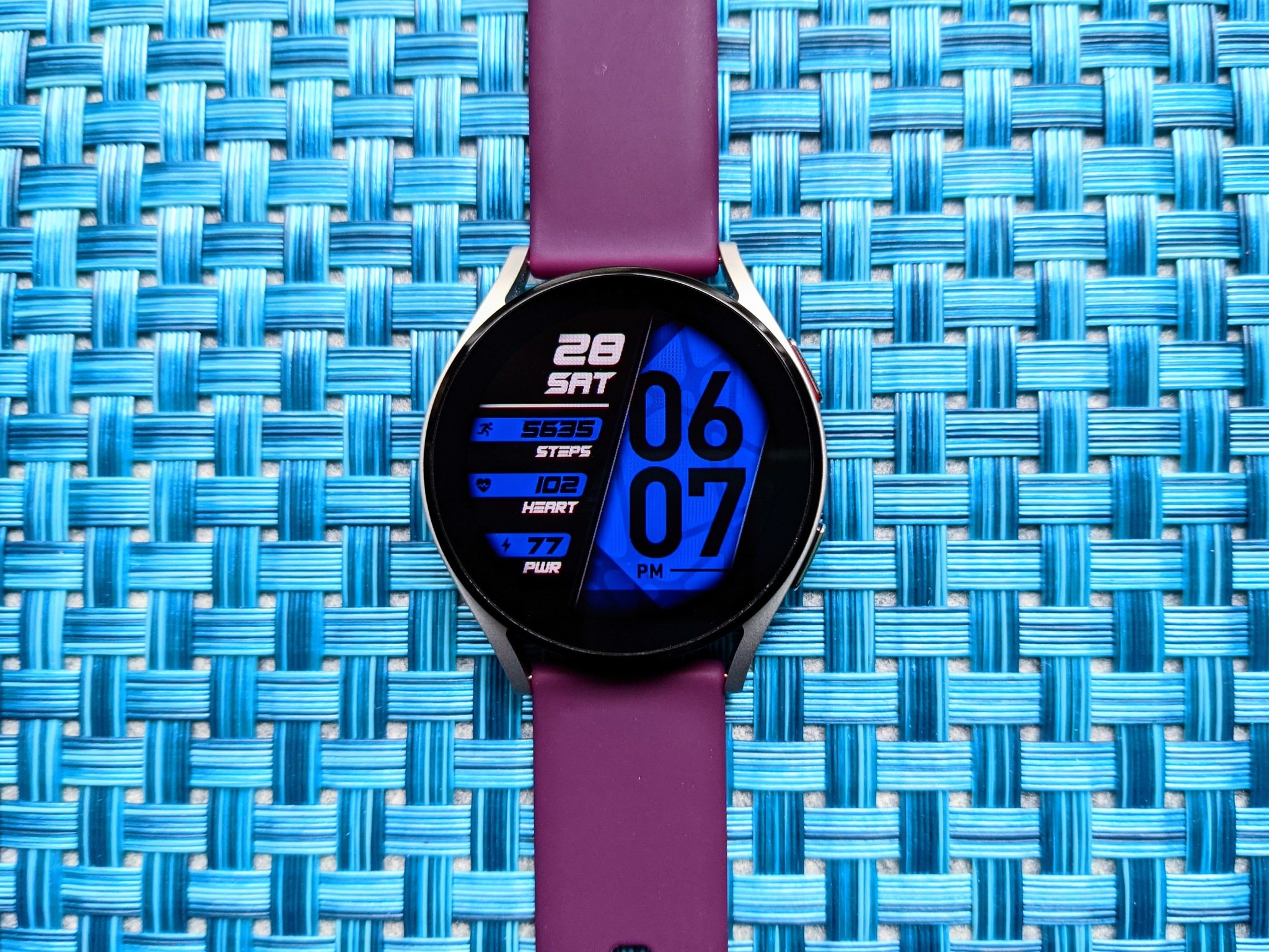
 CEED by Almarinov from Facer ($1.99)
There's always a bumpy transition, and you better buckle up for this one.
After waiting and waiting and waiting, my Galaxy Watch 4 is finally on my wrist! I've been breaking it in over the last 48 hours, finding the cracks and crannies where problems are sneaking through that squeaky clean look Samsung showed off at Unpacked.
Most of my grievances are the usual stumbling blocks of a new generation — the senseless lack of Google Assistant, notifications still take too many taps, and the lack of non-Samsung tiles — but the most irksome problem smacks me in the face every time I lift the watch to my eye line. Watch faces on Wear OS have long been diverse and customizable, but once you step outside Samsung's curated collection, you're going to find plentiful frustrations.
Actually, even with Samsung's watch faces, there are frustrations.
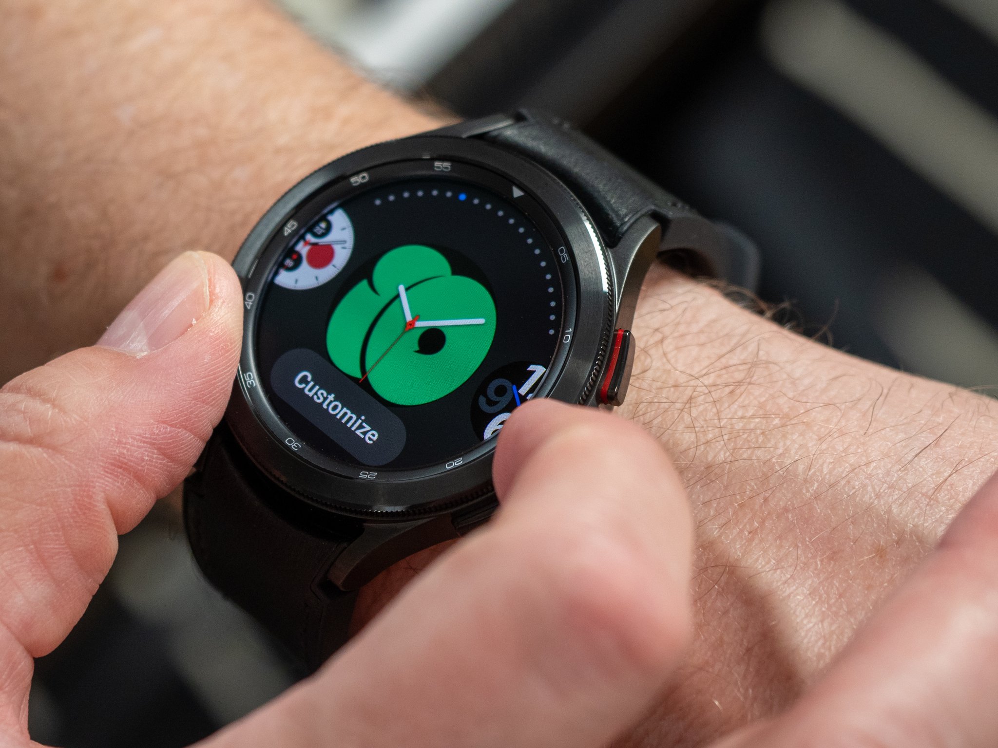
Now, don't get me wrong, Samsung actually makes some pretty great watch faces. I'm fond of the My Photo+ face, which allows you to set a picture, clock style, and then up to four Complications, but our own Chris Wedel and Tshaka Armstrong prefer Digital Dashboard with its distinct color palettes and five Complications. Samsung's watch faces you edit in the Galaxy Wearable app; long-pressing the face and tapping "Customize" does nothing on my Galaxy Watch 4, doesn't even open the customization page in the companion app. Customizing the watch face on a larger screen makes the process easier, but it also means when your phone isn't nearby, you can't change anything about your watch face.
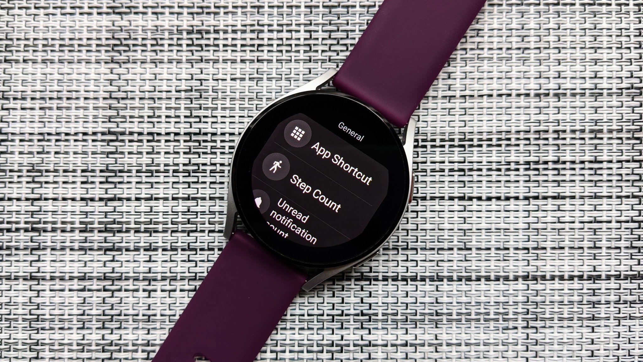
Most watch faces allow you to pick from a variety of color styles, then set each Complication from the list. There's just one problem: You can't choose from the full complication list. While some general Complications are there, you're still missing popular options like App Shortcuts, Google Pay, and third-party Complications. Even worse, most of the Google-based Complications you can use are glorified shortcuts: you can't set it to show a specific Google Fit goal or stat, it'll just show the name and open the app when you tap it.
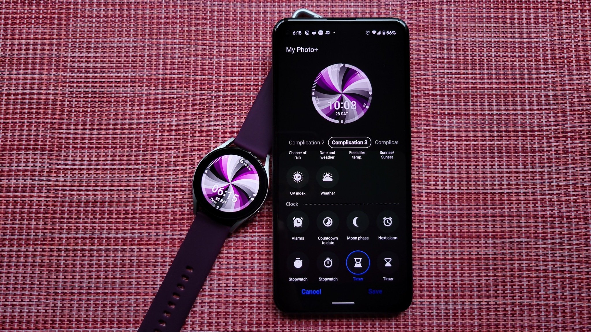 MyPhoto+ by Samsung with a Tapet background
Even with these... complications, the experience with Samsung's watch faces is much better than the Complications SNAFU 3rd party watch faces face right now. You cannot customize third-party faces in the Galaxy Wearable app, and some of the complications are just broken.
I just want a watch face with working HR and a Google Keep shortcut. And right now, that's impossible.
Some of this is quite likely due to the fact that most watch faces aren't updated for the Wear OS 3 platform yet — and they're designed to interface with Google Fit rather than Samsung Health — but it's a frustration that could've been solved had Google and Samsung collaborated better with each other and with developers to ensure that more watch faces would work at launch.
Nevertheless, heart rate is broken on pretty much any non-Samsung watch face; some faces will show no data while others will show a BPM that's inaccurate or current regardless of the update interval you have in Samsung Health. I finally took the plunge into Facer during my search for a watch face that worked, but I was eventually forced back to the Samsung faces because of the slow, inaccurate heart rate in any complicated face. (Most Facer faces work quite well outside health functions, and I was very pleased with the animated Star Wars face I stumbled across.)
Broken or missing Complications were even more of a problem on my favorite Wear 2.0 watch face and one highlighted by Google itself in Wear's Watch Faces section: Looks Watch Faces for Wear OS by Google, by utswo Studios. From my Moto 360 days up until the Fossil Gen 5e I sported this spring, the Quoti watch face remained my steadfast favorite because I could set album art as the background and then the current song info in the complication for a wonderful watch face for music addicts like myself.
Quoti was one of the first face packs I installed on my Watch 4, and once I got Quoti set, I went to Customize it as per my usual. There were two problems: there were no Background options at all anymore, and even the Media controller Complication only works half the time. Well, it'll show the song title if you set the version with one wide complication, but tapping it may or may not pause the music, now will it open the media controller; instead, you'll have to tap that ridiculously tiny music note bobbing at the bottom of the face. Also, heart rate didn't work at all, and the step count only updated every 10 minutes or so.
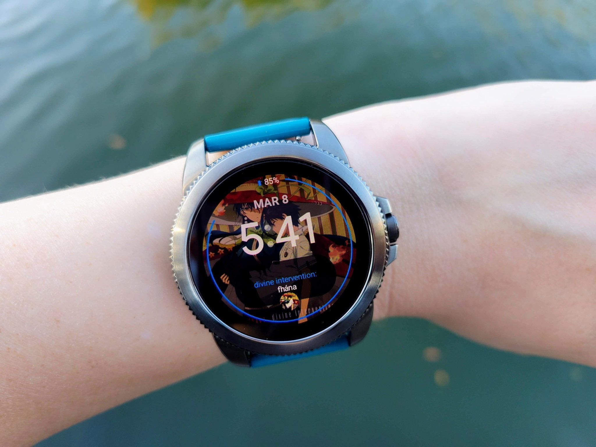 How Quoti is supposed to look, from the Fossil Gen 5e
Looks Watch Faces hasn't been updated since 2017, so I don't necessarily blame the watch face itself (though seriously, utswo, get on it), but I do blame Google for presenting an old, half-broken watch face collection front and center to users who are new to Wear OS. It's one users are more likely to try given that it's one of the few actually, 100% free watch face packs out there. Google needs to be paying more attention when trying to show that Wear OS has actually straightened up and finally gotten its shit together this time.
Even many watch faces that have been updated this month to support Wear OS 3 are seeing Complication issues in regards to health data, though. Unfortunately, that means this could very well be a bug we'll need to wait for Samsung and Google to patch.
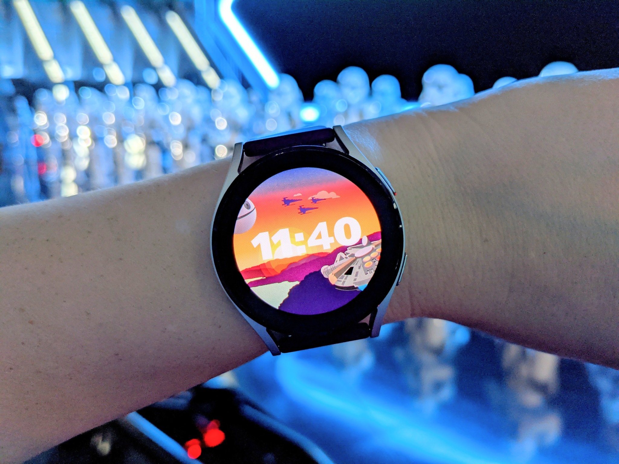 Star Wars | Dynamic by Ernest Karchmit from Facer (Free)
For now, I'm okay with sticking to Facer and Samsung watch faces while I wait for this to be resolved, because the Galaxy Watch 4 is the fastest, smoothest smartwatch I've ever used, and 100% worthy of its title as the best Android smartwatch. It's so nice to tap an app icon and have it appear in a second rather than almost timing out the screen while it tries to load and render. I'm not a fan of the BIA analysis (Jerry's right, it's way too easy to sway with just a glass or two of water before a reading), but having the Sleep graph actually on my wrist rather than having to dig out my phone is nice, especially as I grapple with sleep scores in the 40-60 range most nights.
Off to New York this week for the Qualcomm Sound event; it'll be both my first actual press event and my first time in NYC in about 14 years. Wish me luck and tweet me your NYC pizza recommendations!
— Ara
Tidak ada komentar:
Posting Komentar