The hardware is there, but the software still lags behind.
A lot of anticipation has been riding on OEMs ever since we learned that many of 2021's best Android smartwatches would be getting the Wear OS 3 update. After all, a big overhaul to Google's wearables platform is something that's been needed for years now. But the problem wasn't just software; Wear OS hardware has lagged behind the competition in some very real ways.
The Fossil Gen 6 line of smartwatches aims to begin the healing process for Wear OS users, like myself, who have been burned by sub-par products for years. Quite of the bit of the problem lay with Qualcomm, who has consistently created mediocre wearable chipsets that were both underpowered and power-hungry at the same time. Fossil Gen 6 launches with the Qualcomm Snapdragon 4100+, a new platform that aims to fix quite a bit of that with the help of a more powerful co-processor.
In addition to a better processor, Fossil has packed the gamut of sensors into the Gen 6 to help with health statistics and other important features that are used daily. Top that off with much faster charging, charging rings that won't fall off of the watch (as they have in the past), and general improvements, and you'll see why the Fossil Gen 6 is a surprisingly big step forward. It's just a shame that it launches with Wear OS 2.
Fossil Gen 6
Bottom line: Fossil Gen 6 is a smartwatch with lots of unrealized potential. Solid hardware packs great performance, battery life, reliable health metrics, and ultra-fast charging speed. It's just a shame that Wear OS 2 holds it back so much.
The Good
- Full-color AOD screen
- New health sensors make a big difference
- Sleep tracking works perfectly
- Excellent battery life
- Super-fast charging
The Bad
- The onboarding process is very bad
- Lacks a proper companion app
- Wear OS 2 holds the hardware back
- Performance is hit or miss
- Crown gets in the way when working out
$299 at Amazon $299 at Best Buy $299 at Fossil
Fossil Gen 6: Price and availability
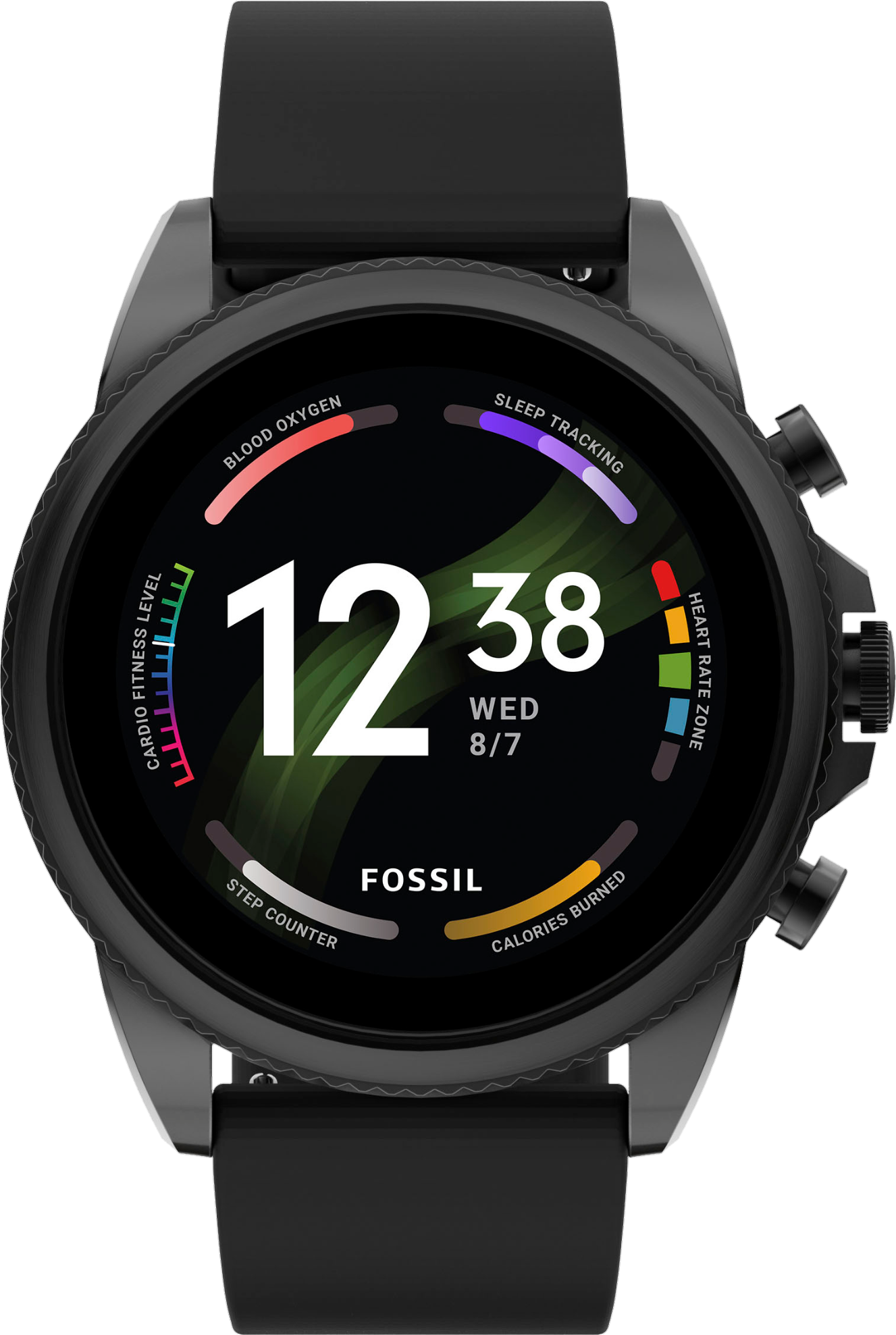
Fossil Gen 6 watches are available in two colors, each with its own price. Stainless Steel retails for $319 and comes with a stainless steel band and body. The black model we reviewed retails for $299 and comes with a choice of one of three straps: Camo Grosgrain (our review unit color), Black Silicone, and Brown Leather.
You can purchase Fossil Gen 6 watches directly from Fossil's website, Amazon, or Best Buy. Since Fossil uses a standard 22mm band with accompanying clasps, you can use any standard band on these watches.
Fossil Gen 6: Mostly excellent hardware
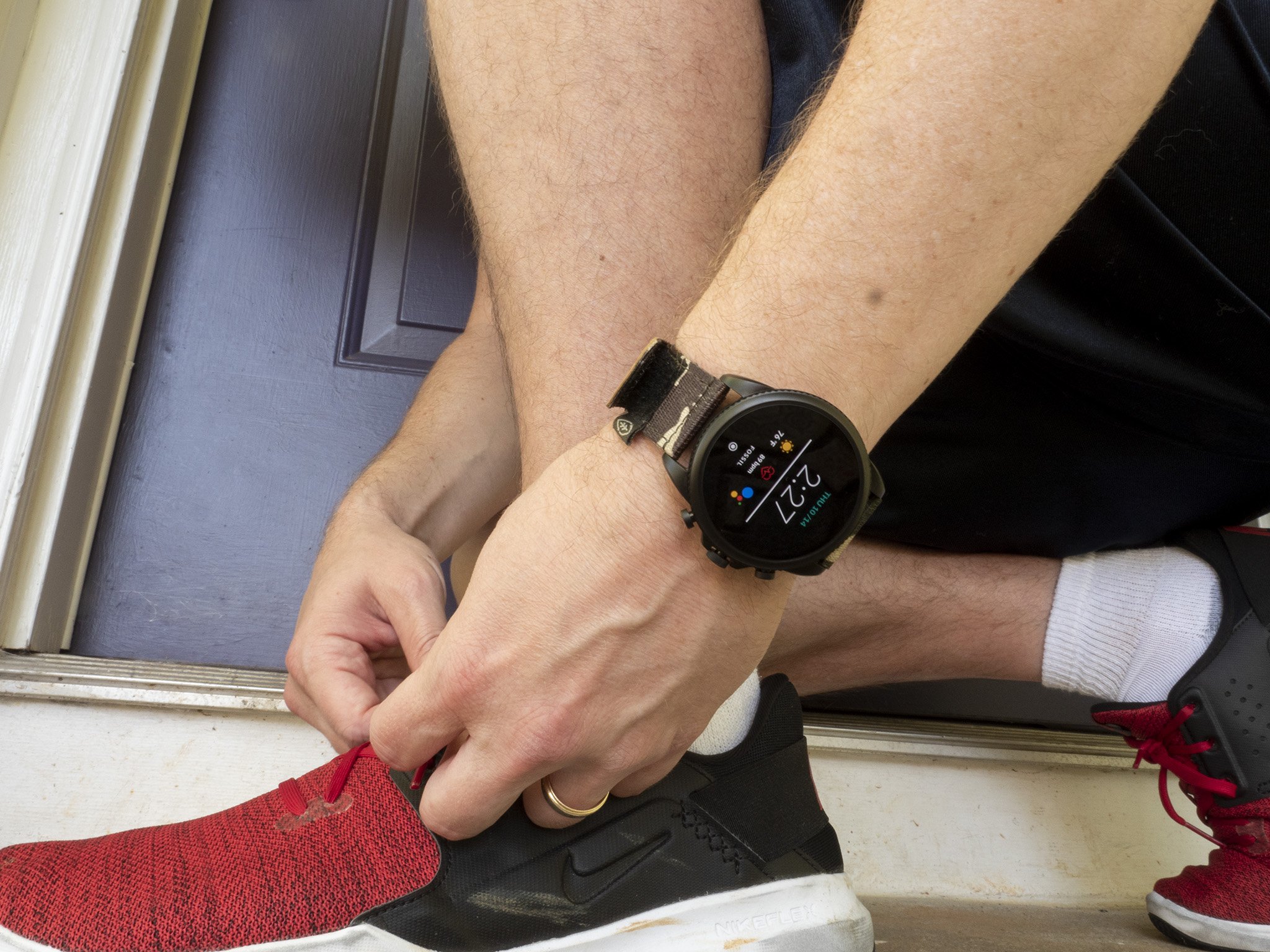
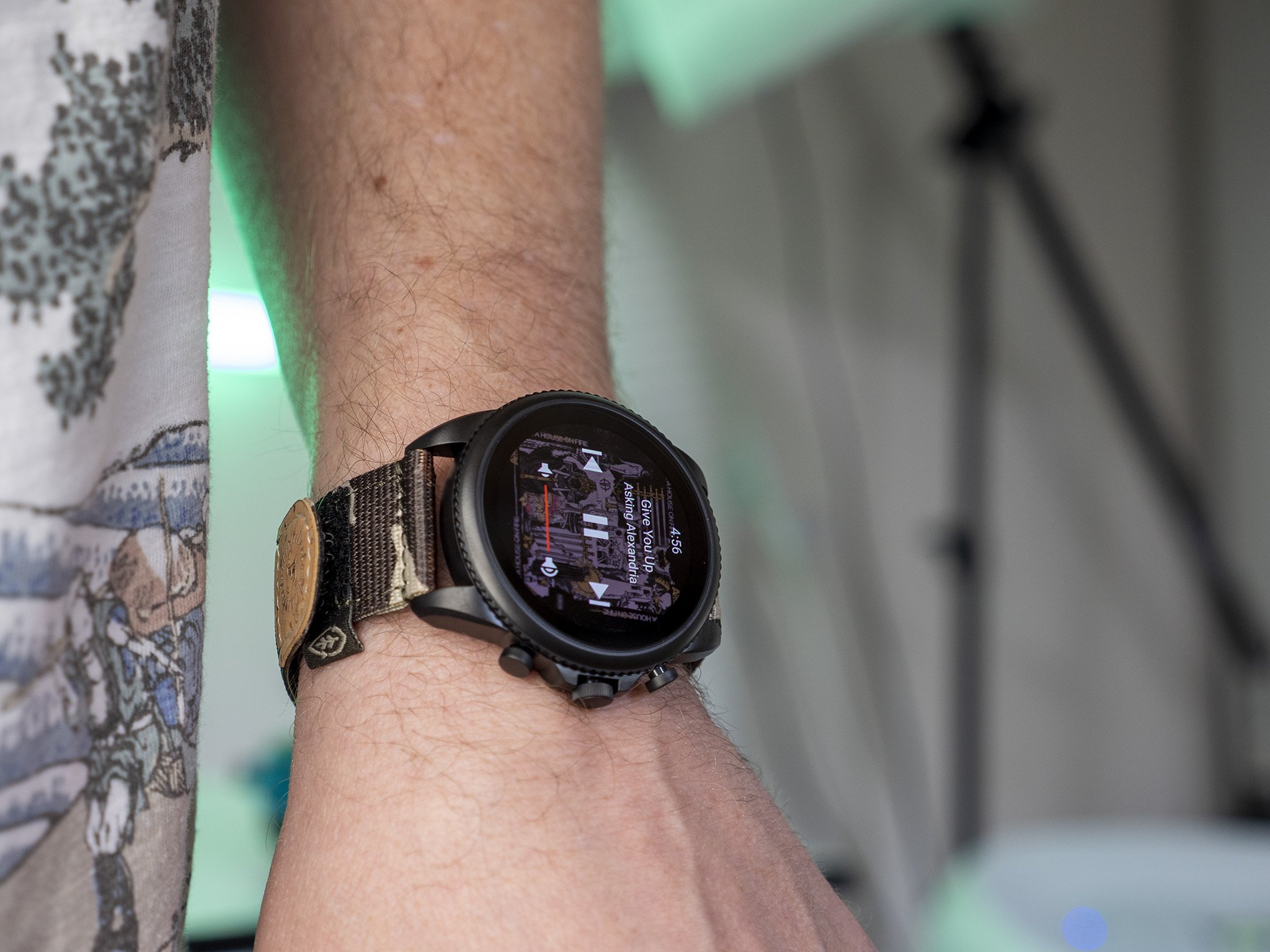
While it's not a radical redesign from the Fossil Gen 5, I fall in the camp that prefers its looks over something like the Galaxy Watch 4, which looks more like a smartwatch rather than a regular one. The metal casing is gorgeous, has a wonderful textured finish, and maintains a good size and thickness that just feels right.
| Category | Fossil Gen 6 |
|---|---|
| Operating system | Wear OS |
| Display | 1.3-inch AMOLED |
| Processor | Qualcomm Snapdragon Wear 4100+ |
| RAM | 1GB |
| Storage | 8GB |
| Connectivity | Bluetooth 5.0 Low Energy, Wi-Fi |
| GPS | ✔️ |
| NFC | ✔️ |
| Heart-rate sensor | ✔️ |
| SPO2 sensor | ✔️ |
| Speaker | ✔️ |
| Sleep tracking | ✔️ |
| Water-resistance | 3 ATM |
| Case size | 44mm |
| Band size | 22mm |
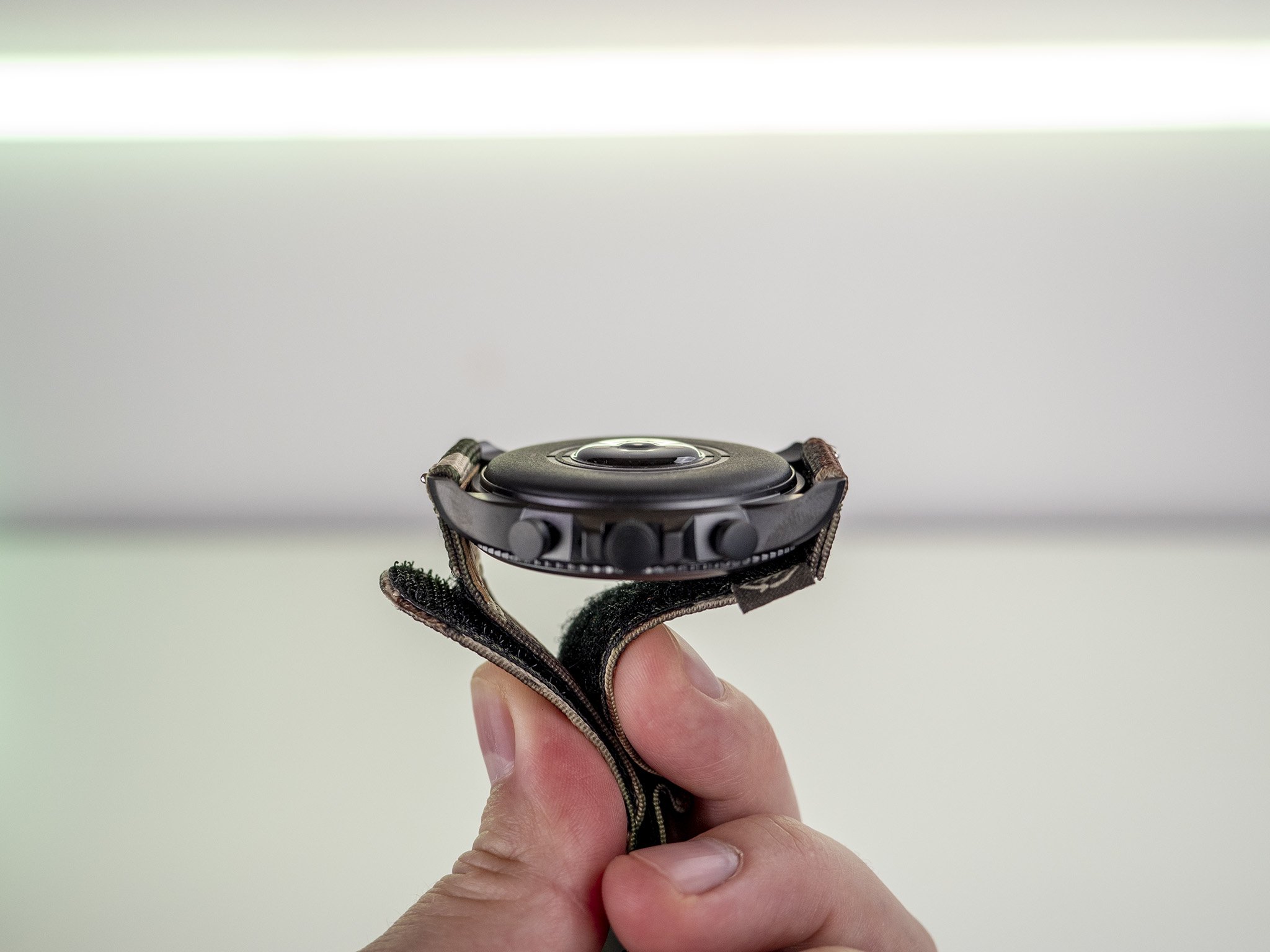
A 44mm watch is inherently a bit on the large side, but this one is quite thin and looks really wonderful on my wrist. Surprisingly, that thinness doesn't affect battery life. In fact, when compared to the Gen 5, Fossil Gen 6 has really excellent battery life. I never ran across a situation where the battery would even be on the low side after the end of a long day, even when I used sleep tracking and exercised for an hour.
When the battery gets low, know that you won't have to leave the watch on the charger for longer than half an hour to get another full day's use out of it. Considering this is probably one of the biggest weak points of the Galaxy Watch 4 — one of Fossil Gen 6's main competitors — it'll likely be an important point to consider when comparing the watches.
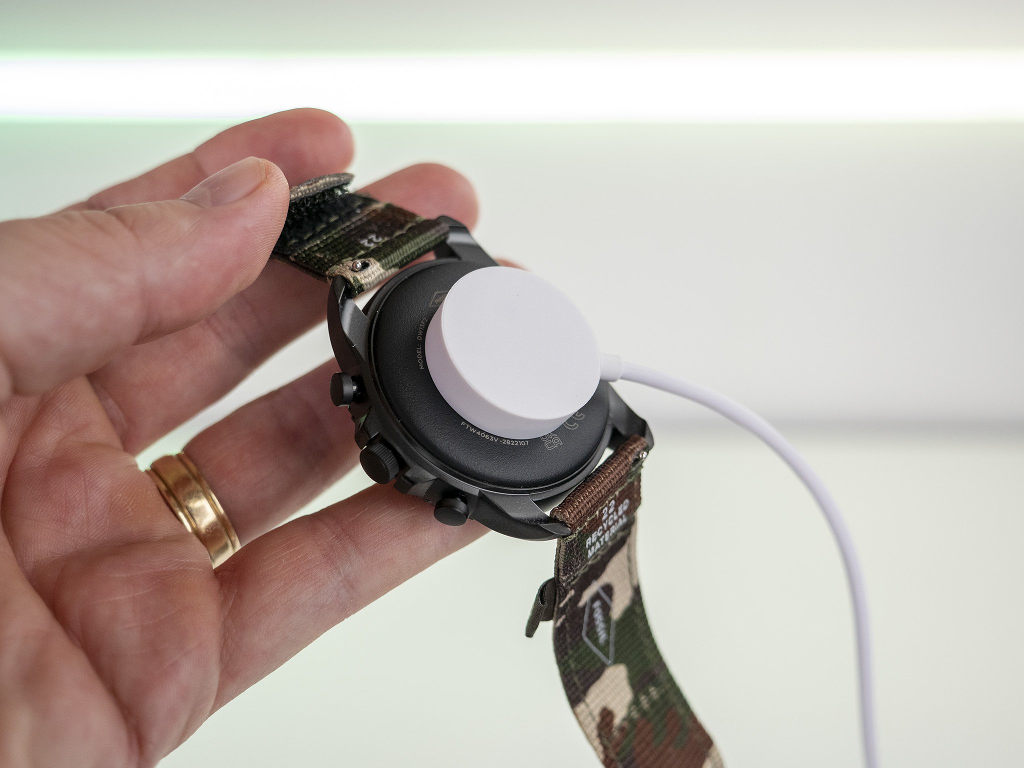
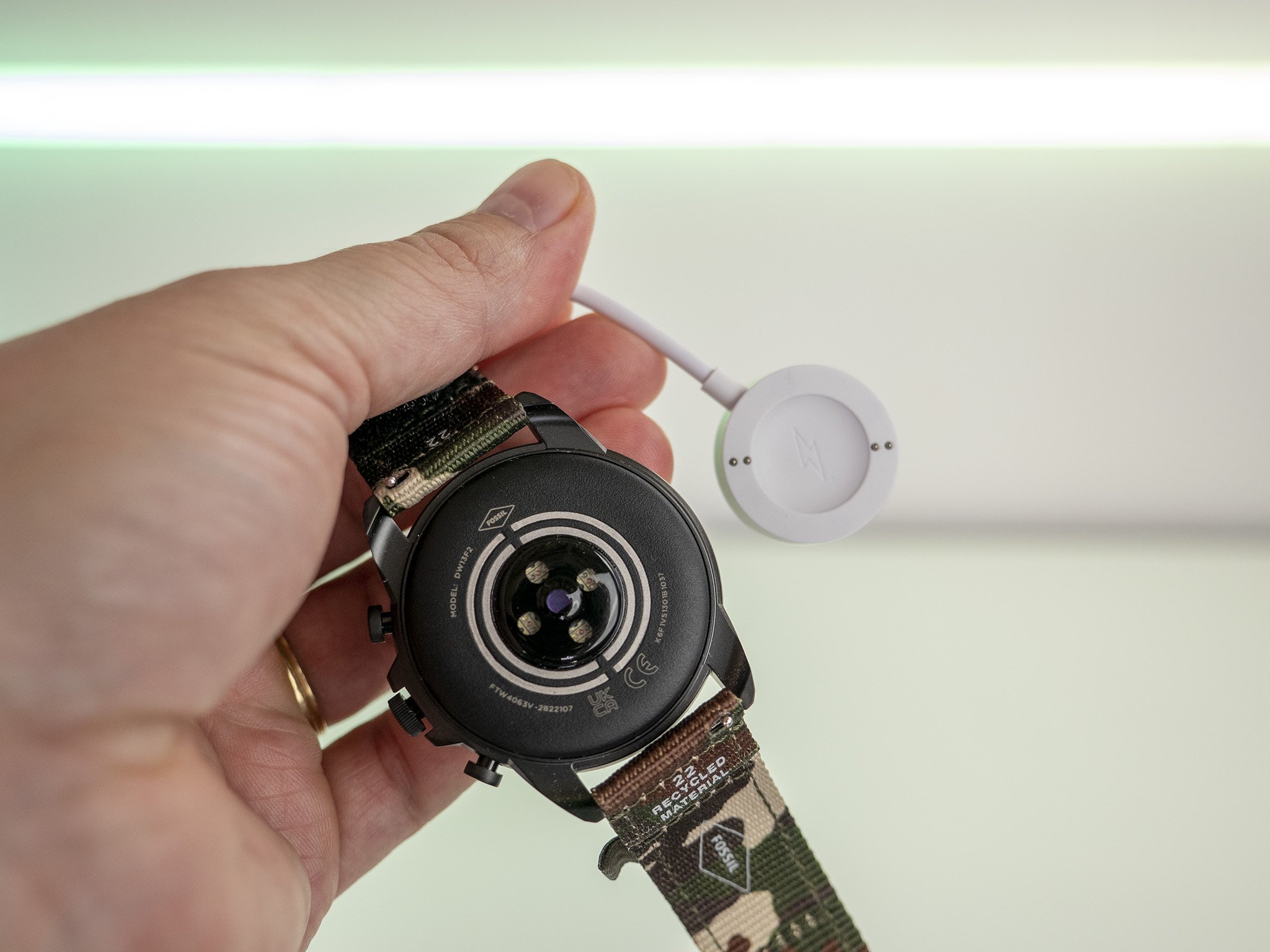
Fossil's charging coil improvements help significantly with speed and avoid the pitfalls that other watches have fallen into over the years — namely that some watches had to sit just right on the charger in order to charge.
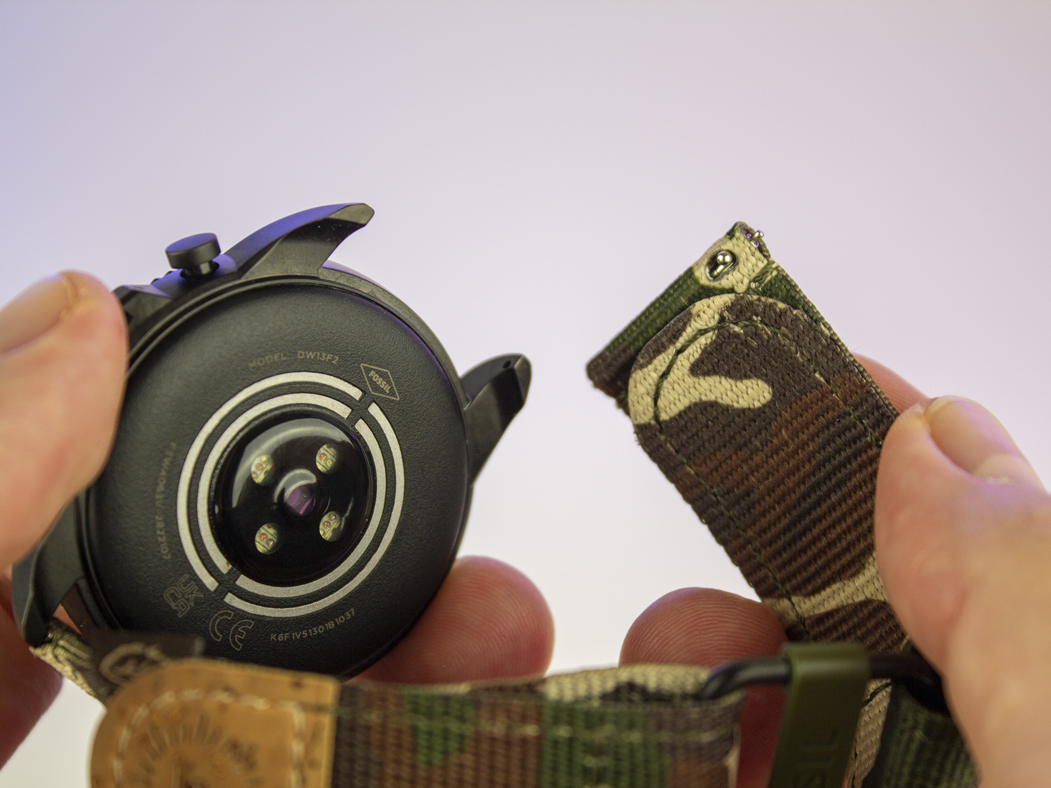
Fossil also fixed the charging ring problem from previous generations by embedding them into the casing. This keeps them from falling off over time and makes it impossible to misalign the charger. That lovely magnetic snap was always met with a charging screen and never made me think it would fail.
As with other Fossil watches, there are three battery modes to choose from: daily, extended, and time only. By default, the watch will automatically switch to the extended mode when the battery gets low, helping the watch last until you can get to a charger, but, in my testing, it didn't seem to extend battery life all that much.
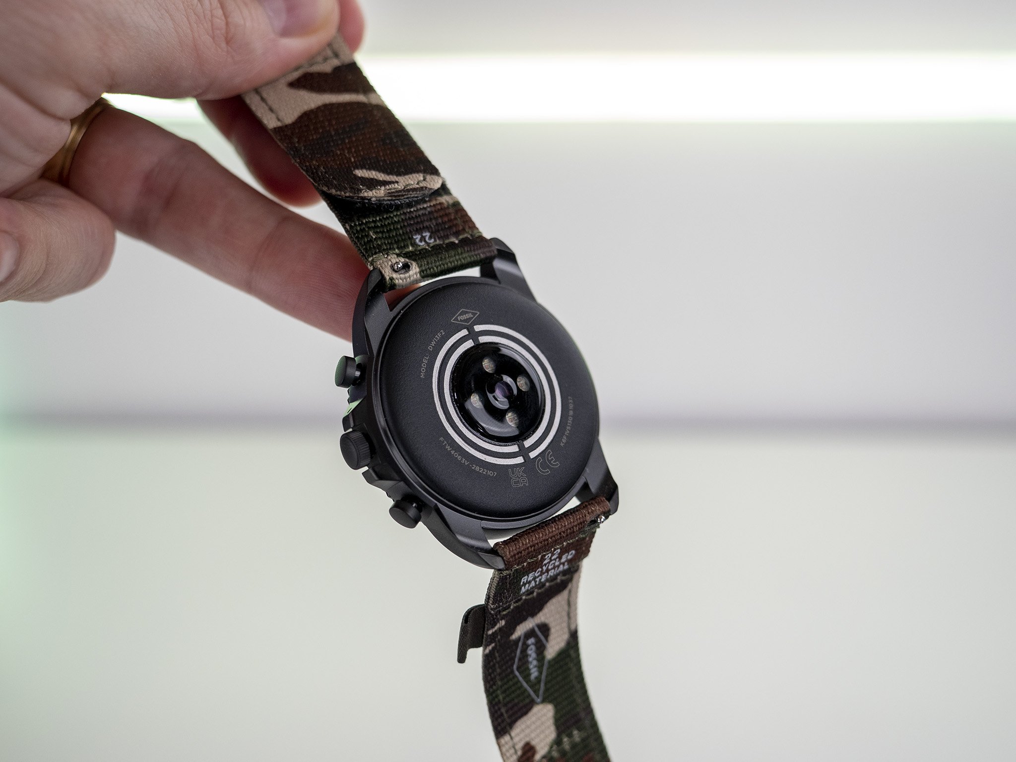
The new Snapdragon 4100+ inside includes an important 1.7GHz co-processor that enables the watch to use always-on health metrics without affecting performance or battery life in a meaningful way. This enables more granular heart rate readings, more accurate sleep tracking, and just better overall health statistics.
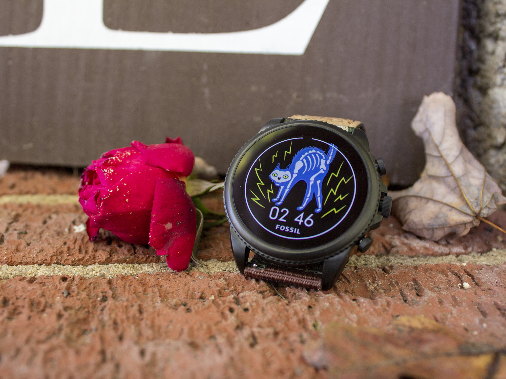
More than that, the co-processor also lets Fossil do more with the always-on display, including adding a splash of color. Previously, always-on displays were usually just white text or imagery on a black background.
The new processor enables more accurate health tracking statistics, including more granular heart rate readings and an always-on color display.
Fossil packed the watch with a bevy of sensors, including HRM, accelerometer, altimeter, compass, gyroscope, off-body IR, SpO2, and an ambient light sensor to ensure that everything works exactly as you imagine it should. True to that, I found that workout tracking felt accurate, sleep tracking was spot on, and even the vibration motors felt wonderful when a notification came across my display.
The Snapdragon 4100+'s overall performance was quite a bit better than the 3100 in the previous generation, and I found fewer stutters and delays when using the watch daily. In fact, some of the features like music playback were so much faster that I found myself using them daily — a sign that Wear OS watches are finally becoming fast enough to be truly useful.
While it's a major bummer to buy a new watch with an old OS — that's Wear OS 2, if you're keeping track — Wear OS 3 is right around the corner. The strengths of the hardware improvements Fossil has made will likely only be further highlighted by the new OS, which should be much smoother, better organized, and further optimized for wearable form factors.
Fossil Gen 6: Software that lets you down
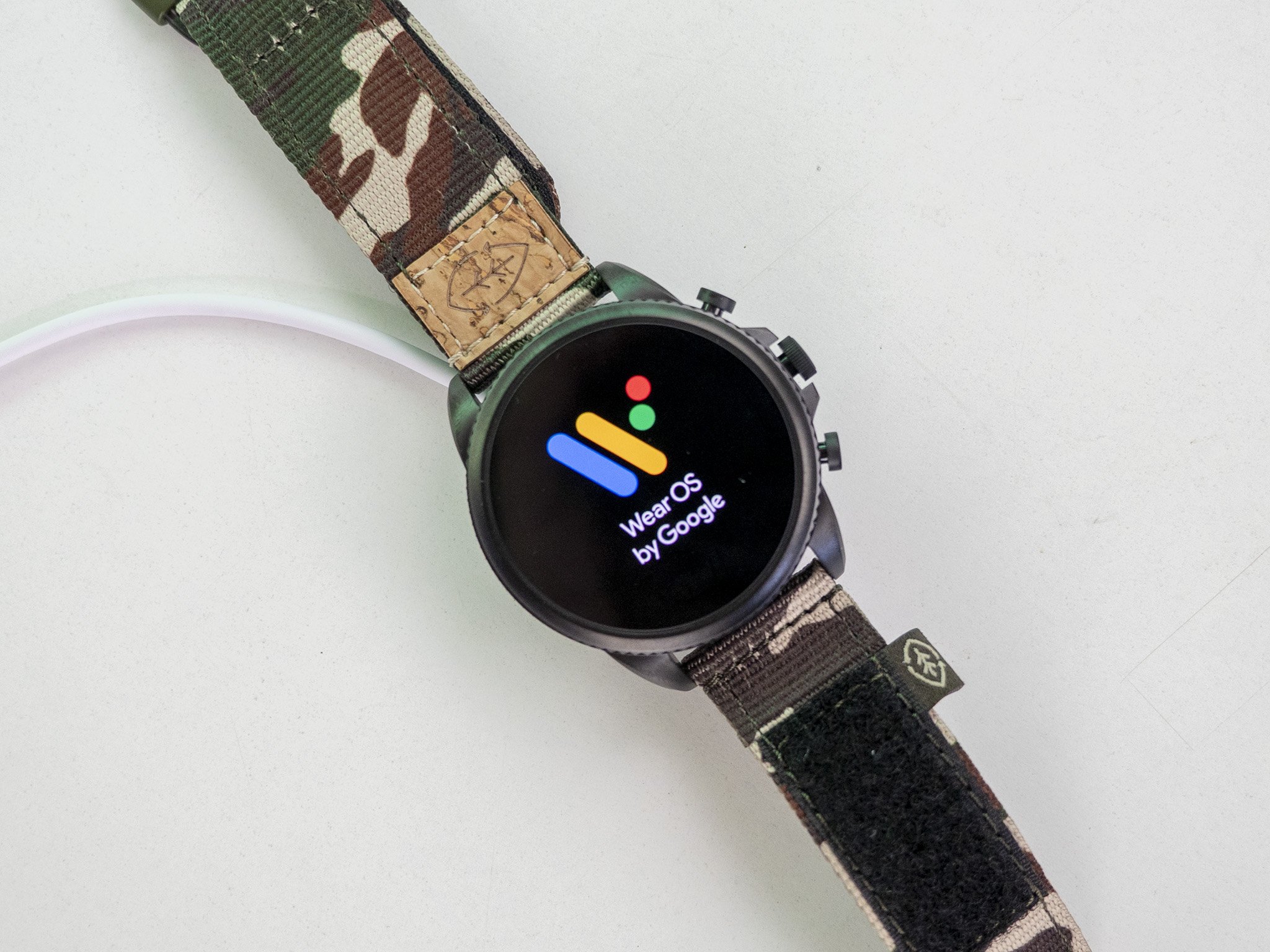
First impressions are everything, and while the hardware gave me the warm fuzzies when taking it out of the box, all of those positive feelings went out the window the moment I began the setup process. I imagine this will be ironed out a bit in Wear OS 3 but, until then, setup and the first day are painfully bad experiences.
Wear OS 2 is still terrible, and it ruins the good first impressions the hardware made.
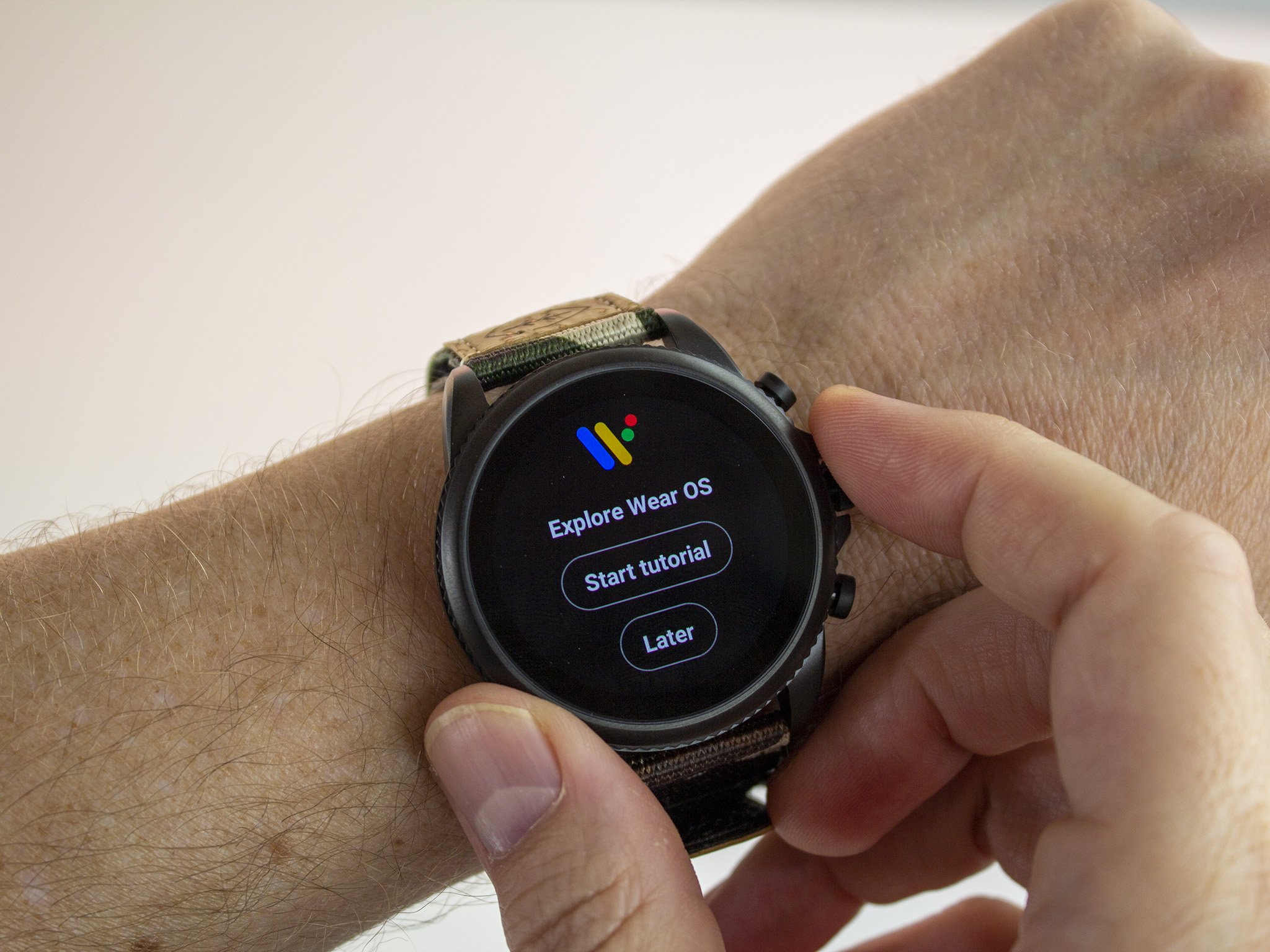
First off, you'll have to enable everything from the get-go. That includes apps, sensors, permissions — you name it. Because just about everything is disabled upon first use, it feels like there's no real direction given for setting up the watch at all. Why do I need to enable basic health tracking features at all? Shouldn't all these things be enabled out of the box when that's the main reason the majority of folks buy a wearable?
I don't really care whether this is a Wear OS 2 or a Fossil problem. It's a problem that everyone buying the watch will run into, and it makes an absolutely terrible first impression.
Similarly, the first 24 hours of use was a massive lagfest that was, quite literally, unusable most of the time. Swiping on the watch face didn't work half the time (or less). Opening notifications would sometimes work or, when it did work, take so long that the default 5-second screen timeout would occur before a response happened. Opening the keyboard or calling up Google Assistant was also terribly slow initially, bordering on useless most of the time; — all problems that ironed themselves out after 24 hours of use.
 Days in, I'm still dealing with granting permissions to basic functions.
But here's the crux: how many people will buy a watch like this and go through that horrendous experience, then decide within 24 hours that they want a refund? I surmise most people aren't patient enough to wait even a day for better performance, and it only continues to highlight the problems that Wear OS watches have had for years. They're slow, inept, and problem-ridden.
Sometimes tapping an action would take 3-5 seconds to generate a response and never gave me a visual cue of acceptance.
Once those performance issues were ironed out, I still ran across several scenarios where the watch was obviously thinking and didn't do a good job of letting me know. For instance, there were plenty of times where I'd swipe or tap an action, and nothing would happen.
Sometimes it would just take 3-5 seconds and would eventually pull up what I wanted but didn't present any sort of visual cue to let me know it accepted the input. A rotating circle would have been fine. Anything, really. As it stands, I sent several text messages multiple times because it didn't give me a visual cue that the button was pressed.
Voice texting still takes a long time to pull up, an irritation that irons itself out once Assistant finally wakes up. Speech recognition is blazing fast and transforms your voice into text essentially instantly, but the process is still slow and cumbersome to use.
While you can do a lot on your watch, it's also nice to have a companion app on your phone to get things done quicker, especially when it comes to delving deeper into health tracking data.
Curiously, companion apps are basically nonexistent. For example, the Google Fit app is the only way to view your data truly in-depth, but the Wear OS app never asks you to install it — or, at least, didn't ask me — and you can't customize your watch face from the Wear OS app at all. Sure, you can change them, but all customization is done on the watch itself.
It's too easy to accidentally press the crown while working out.
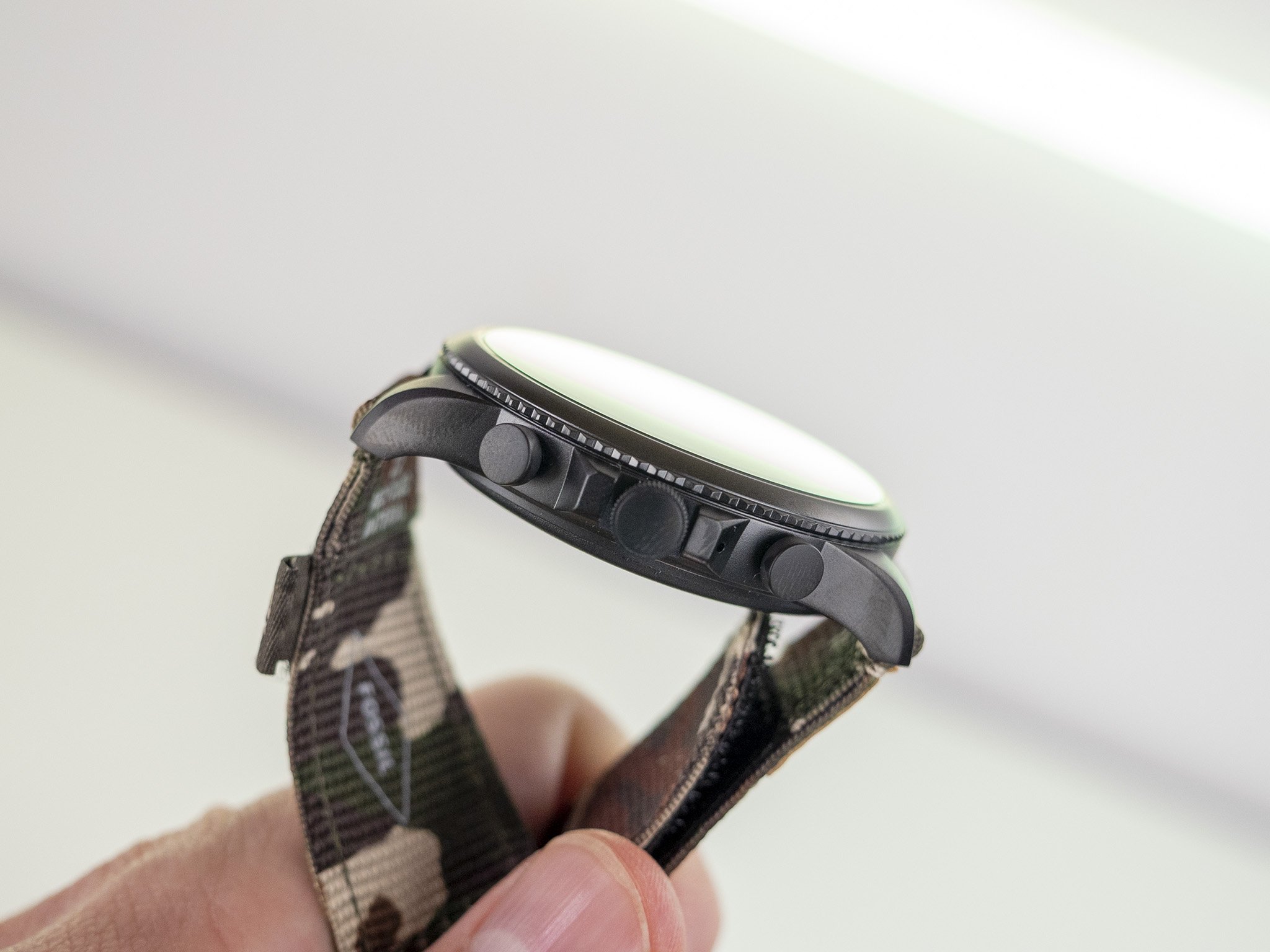
One of the major hardware changes over the Gen 5 is the inclusion of guards around the rotating crown. This falls in line with more traditional watch design but, at least in my use, makes it more difficult to use the crown to scroll through the watch's UI. I'd definitely prefer it to be without the guards.
Furthermore, the crown position itself is problematic for a smartwatch. While it looks nice on a regular watch, the reality is the crown on a smartwatch does much more than a traditional watch. Without exception, every time I worked out, I would accidentally call up Google Assistant multiple times.
It's a side effect of having the watch on my left hand — the normal position for a watch for me — and while putting it on my right hand would effectively solve the problem, it presents another one: the crown is extremely difficult to use when in this position.
Fossil Gen 6: Competition
Samsung's Galaxy Watch 4 is the only watch with Wear OS 3 watch on the market right now, thanks to a partnership between Google and Samsung. While I don't like the styling of the Galaxy Watch 4 as much as Fossil's design, there's no denying that the rotating bezel is a superior input mechanism when compared with a digital crown. Battery life is about the same as the Fossil Gen 6, though, and it only works best when paired with a Samsung phone, limiting the market a bit.
The TicWatch Pro 3 Ultra GPS seems to be the Wear OS 2 watch of choice right now, as it has better performance — thanks to Mobvoi's own co-processor, it seems — and its time-only mode is better than Fossil's in every way. Battery life is also better, even in full smartwatch mode, and it doesn't have that annoying three o'clock-positioned crown that got in the way for me on the Fossil Gen 6. It's also getting Wear OS 3 later, so you don't need to worry about it being obsolete right away.
Fossil Gen 6: Should you buy it?
You should buy this if ...
- You love a traditional-looking watch that's also smart
- You want a smartwatch that'll get Wear OS 3
- Features like sleep tracking are important to you
You shouldn't buy this if...
- You want a full-featured watch with multi-day battery life
- Your workouts include more than just cardio
- You want an always-on display when in time-only mode
In my estimation, the only real hardware flaw here is the crown location and design, something that likely won't bother you if you don't exercise with your watch. Every other negative with the watch revolved around the aging Wear OS 2 software, which will soon be replaced by Wear OS 3.
Once Wear OS 3 hits, the hope is that most of the flawed parts of the experience will be ironed out. Odd performance issues shouldn't exist on a newer processor like the one inside Fossil Gen 6, and the rest of the UI or setup issues could likely be fixed in a better OS update. To me, this is a product that was well designed on Fossil's behalf but is left behind by Google's poor software design. If that can get ironed out, this will be an absolutely killer smartwatch.
Fossil Gen 6
Bottom line: Fossil Gen 6 is a solid follow-up to Gen 5 and solves many of the hardware issues. Unfortunately, Wear OS 2 still presents a host of problems that likely won't be ironed out until the Wear OS 3 update lands in 2022.




Tidak ada komentar:
Posting Komentar