This is still the Android we know and love.
"The settings are too colorful."
"How dare they support screens with notches."
"The time is on the LEFT??? WHAAATTTT!!!!"
If you've spent any amount of time reading up on Android P's first developer preview, chances are you've come across comments along these lines. Some of the changes found in DP1 have left many Android users shaking with fear and anger, and while some of the design tweaks are questionable, there's nothing here worth breaking a sweat over.
Google will release three other developer previews before Android P goes public, meaning much of what we're seeing right now will likely change and become a lot more polished by launch day. With that in mind and based on what we're seeing so far, these are my initial impressions of Android P.
Confession: I like the new UI
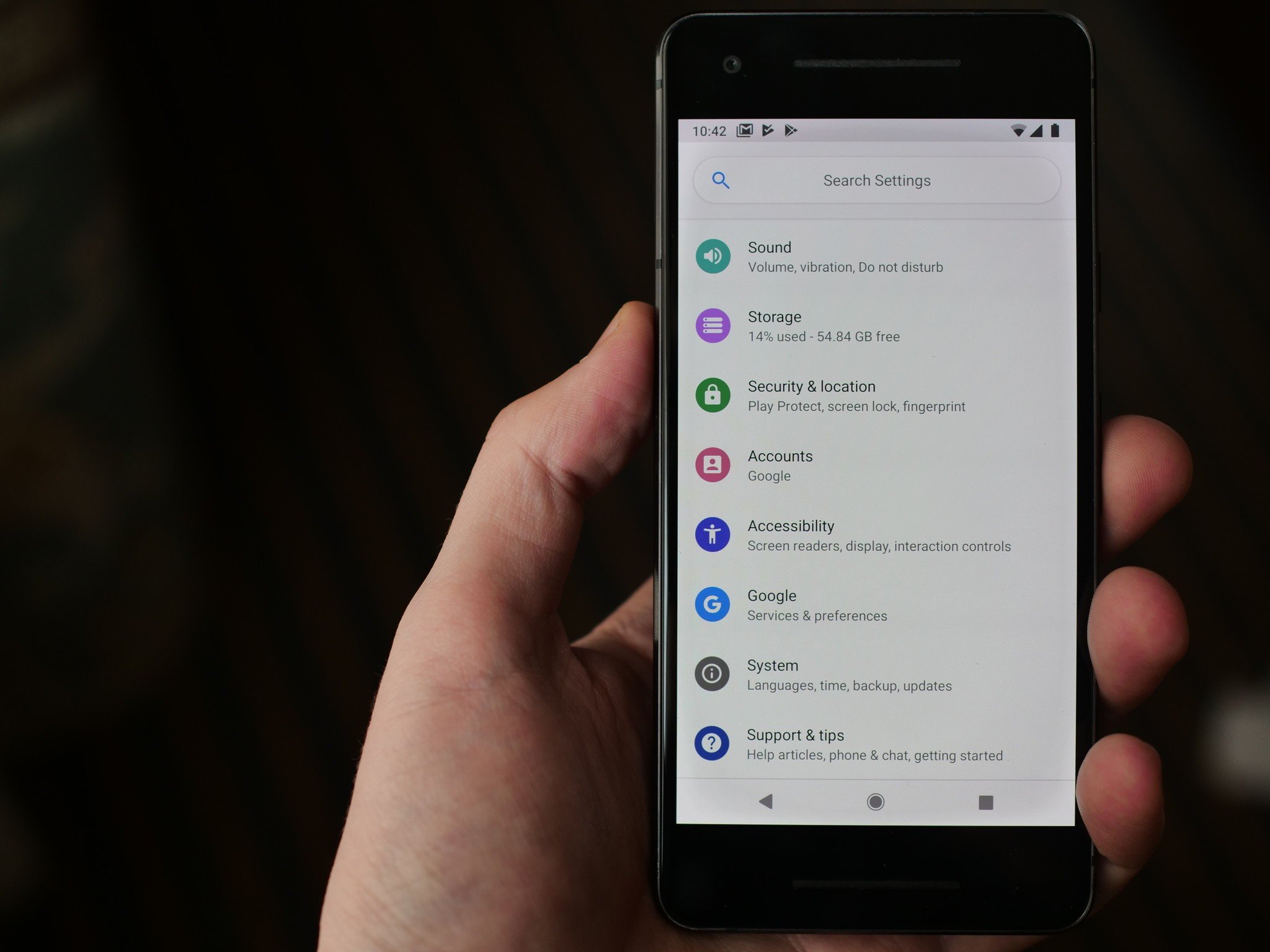
Android P looks very similar compared to Oreo, but there are a couple key differences that have been throwing people for a loop – the quick settings panel and settings page.
In Android P, quick settings have adopted a rounded, more colorful aesthetic with circular icons and blue accent colors in favor of the white and gray ones currently found in Oreo. It's been referred to as "cartoony" and "childish", but I honestly don't hate it. The new look gives Android a bit more personality, and it blends nicely with Google's Material Design.
The settings page has seen similar treatment, too. The search bar at the top has rounded corners, and the icons for each settings page have been turned into circles – each one with its own unique color. It's quite the change from Oreo's monochrome color palette, but again, it's something I'm on board with.
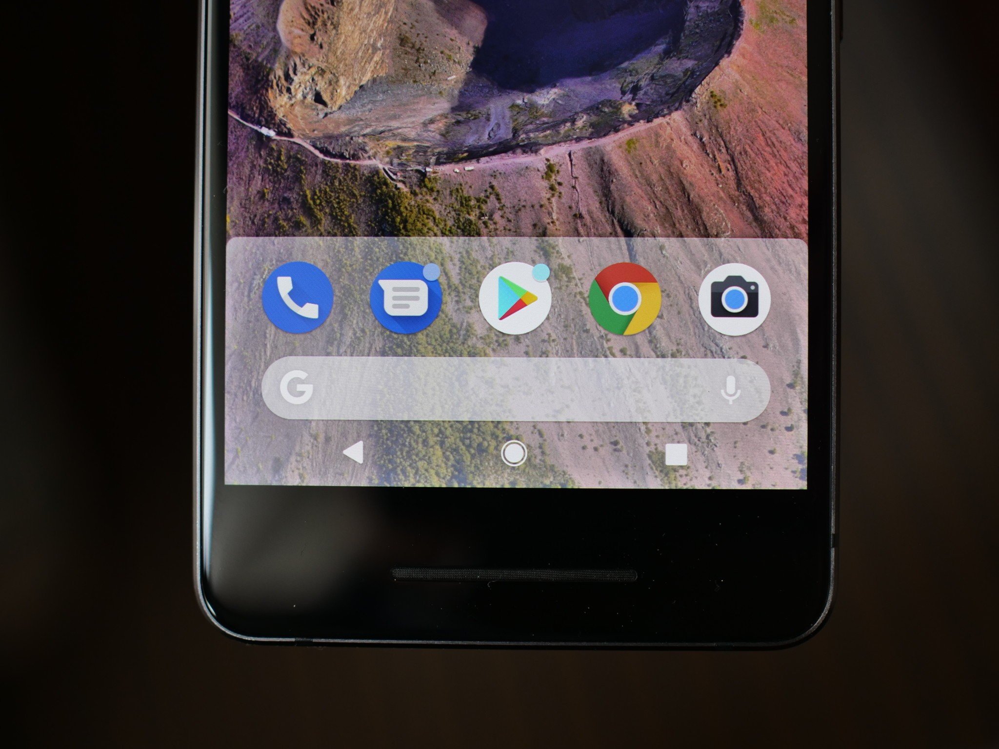
A lot of what we're seeing so far in Android P shows an evolution in Material Design. Things are becoming more rounded and circular, there are more splashes of color where things used to be gray, and the notification tray and home screen dock have more card-like designs. This is likely our first glimpse at Material Design 2.0, and I personally can't wait to see more of it.
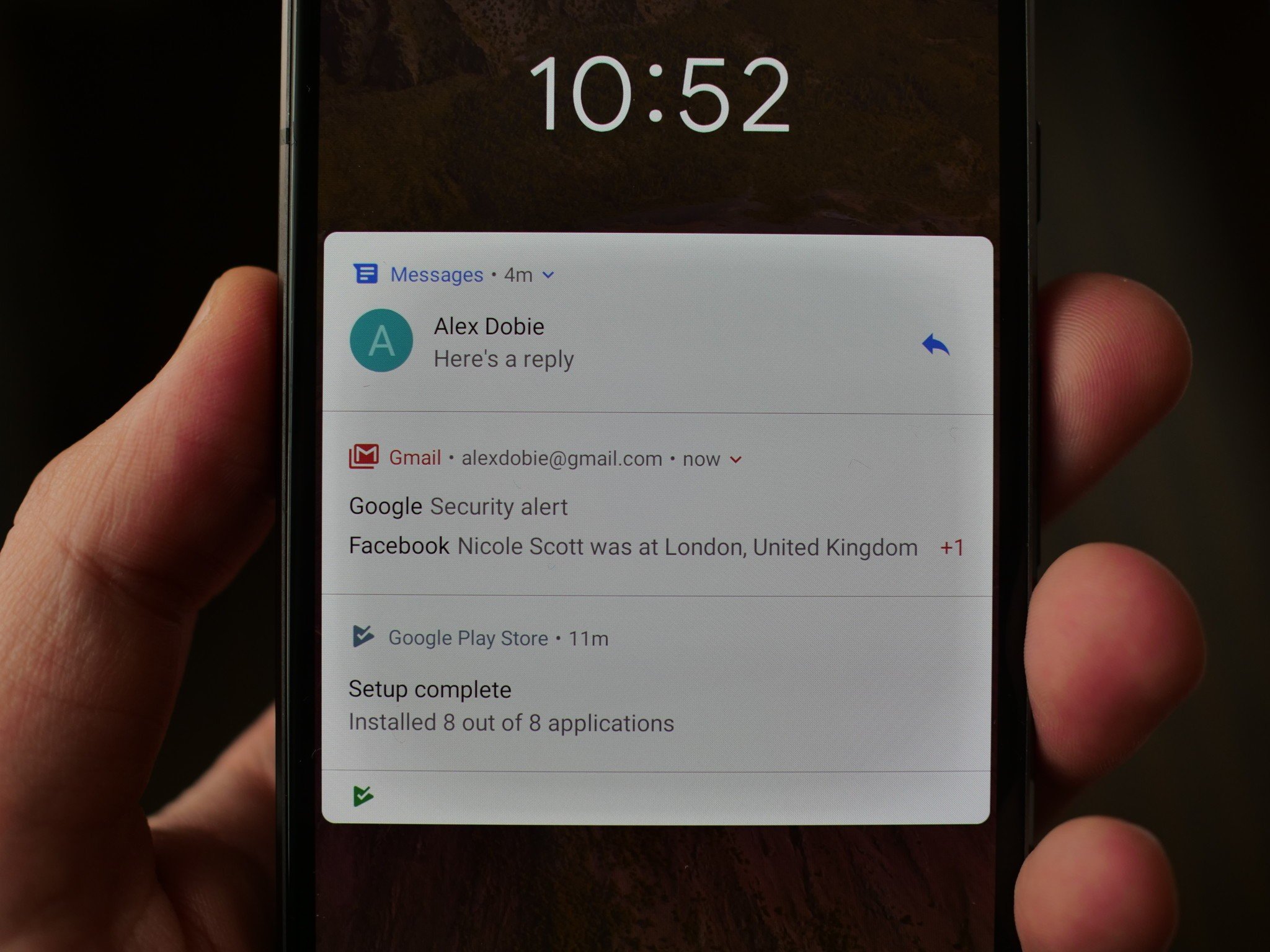
Android's already great notifications are getting even better
One of Android's most underrated yet critically important features is its handling of notifications. Android's already years ahead of iOS in this department, and with Android P, they're going to get even better.
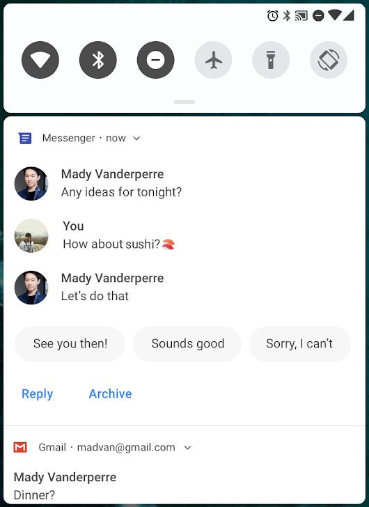
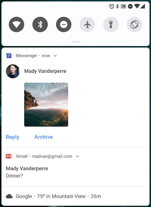
Android P will allow apps to show full pictures/stickers in the notification panel, and even more exciting, smart/quick replies are being added as well. This looks very similar to Google's recently launched Reply app, and having this functionality built into Android by default is awesome.
For someone like myself that uses their phone mostly for work purposes, notifications play an essential part in my day-to-day routine. Android already makes it easy to sift through a heap of piled-up notifications, and the new features P is touting off will only make managing these even easier.
There's a lot going on behind the scenes
Those user-facing features are enticing enough on their own, but just like Oreo, there's much more going on behind the scenes that'll help elevate the user experience day after day. I won't run through every single change, but some of the ones I'm looking forward to the most include:
- Autofill will work with web browsers by default
- Moving your cursor when editing text has a zoom-in effect so you can more easily see what you're doing
- Do Not Disturb is much simpler. Instead of messing with three different profiles, you now just turn it on and choose what notifications you want to hear
- Pixel 2's Always-on-Display now shows your battery percentage at the bottom of the screen
- New screenshot button when holding down power button w/ built-in editing tools
- A microphone on the Google Search bar in Pixel Launcher to prompt the Google Assistant
More could change with the Pixel 3
In addition to the changes and polish we'll see with future developer previews, there's a good chance Google will have even more software treats for us when it launches the Pixel 3.
Even after Oreo's public release, the Pixel 2 was the first phone to introduce the Google Search bar below the app dock, the At A Glance widget, the dark theme that appears based on the wallpaper you use, etc.
All of Android P's main features/changes will be out in the wild by the time of its public release in Q3 of this year, but don't be surprised if Google has a couple more goodies up its sleeve to show off alongside its new hardware.
Take it easy
Like I've mentioned a couple times already, the Android P we're seeing right now with Developer Preview 1 is by no means a resemblance of what the finished product will be like. A good deal of the features will remain intact, but any rough edges we're seeing will be polished up and gone within the coming months.
Even with that being the case, I'm already liking a lot of what I'm seeing. The new design tweaks might take some time to get used to, but like I mentioned in my Android P wish list, it's about time Google gives Android a visual refresh.
Add this updated look together with all of the small features going on behind the scenes, and we could very well be looking at one of the best Android releases in some time.
I don't know about you, but I'm damn excited to see where we go from here.

Tidak ada komentar:
Posting Komentar