Hmmmm 🤔
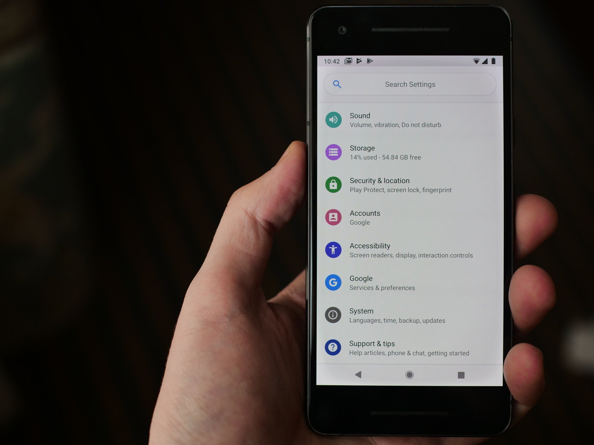
Android P's first developer preview was released on March 7, and so far it's been met with a mixed bag of reactions. While there's a lot of helpful new features, not everyone is onboard with the design changes found with the quick settings panel and main settings page.
Android P
These two areas have seen a visual update with brighter colors and circular icons, and shortly after the developer preview had been out in the wild for a few hours, some Redditors were quick to point out that this updated design looks an awful lot like a Substratum theme in the Play Store.
The theme in question is Flux White from developer giannisgx89, and the similarities between it and Android P are hard to ignore. There are many elements of Flux White not found in Android P, such as its nav-bar style, multiple color accents, and custom boot screen, but the quick settings and settings page, in particular, look a lot alike.
Flux White
I'm not insinuating that Google flat-out copied giannisgx89, but it really is remarkable just how much alike Android P and Flux White are.
I personally like the aesthetic Google's shooting for, and seeing as how Substratum themes won't work with Android P, at least one of its best ones is now included out of the box ¯_(ツ)_/¯.


Tidak ada komentar:
Posting Komentar