Take a look at a huge fundamental change to Android navigation
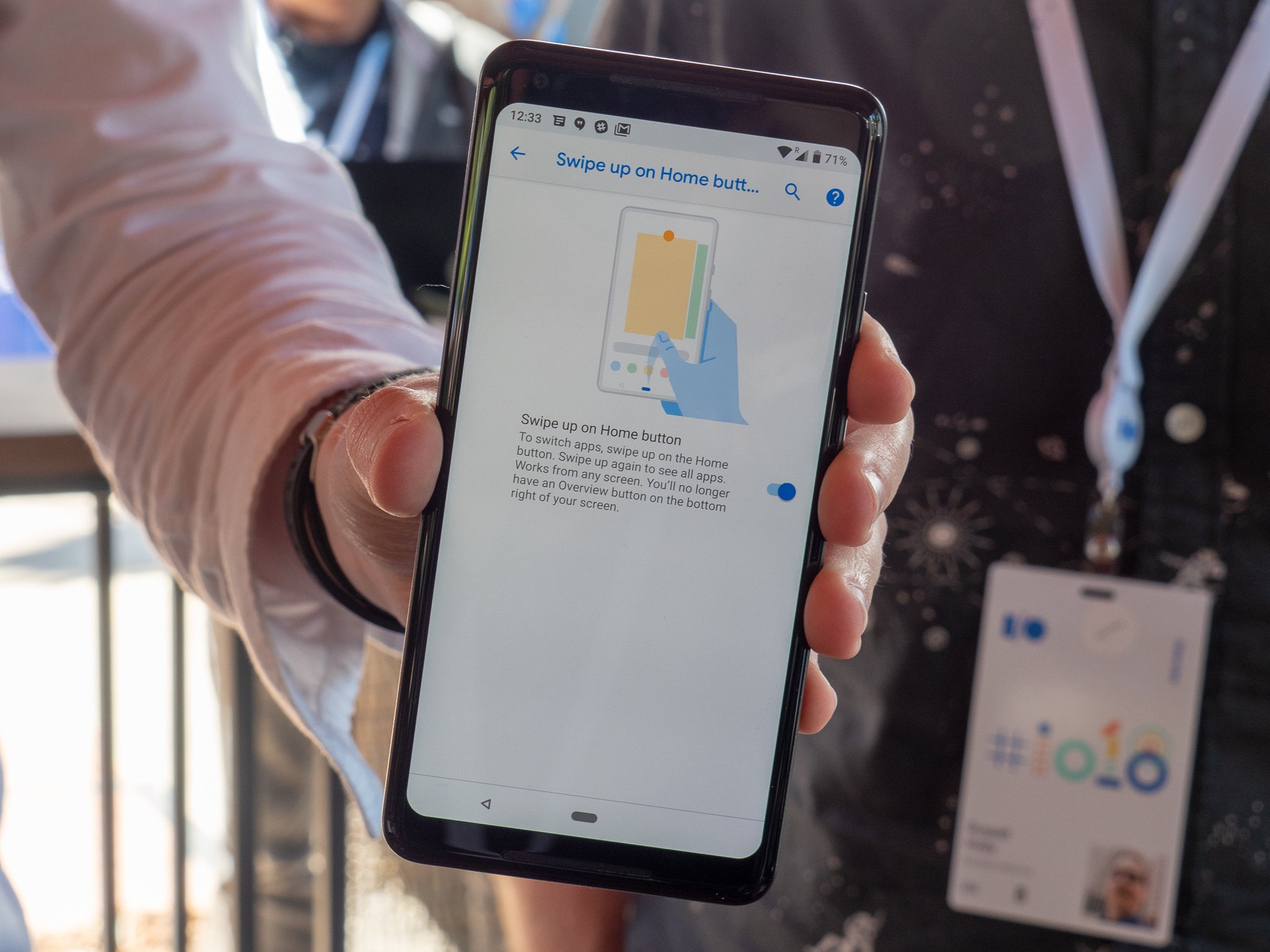
Android P's consumer launch is exciting for a whole bunch of reasons, not the least of which being a brand new gesture navigation system that eschews the standard "back, home, recents" buttons we've all grown accustomed to. The replacement is a gesture-based interface that hides the recents button, and even the back button sometimes, to hopefully let you move more fluidly and intuitively through the interface.
But when you install Android P on your phone, you won't actually see this new gesture navigation system by default — you have to go enable it to experience this significant change to the way Android works. Follow these steps:
- Open up your phone's Settings.
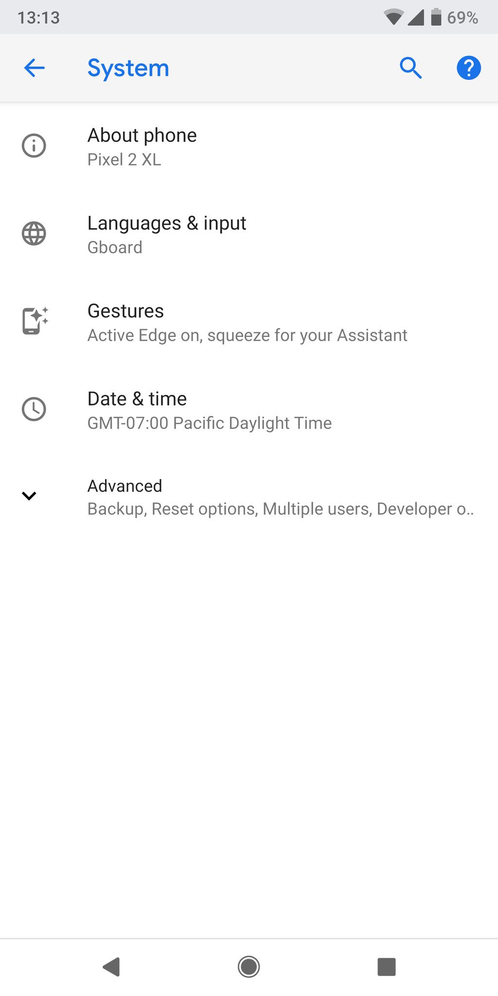
- Scroll down and tap on System.
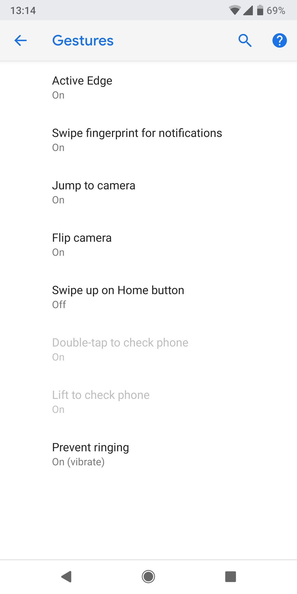
- Find Gestures and tap on it.
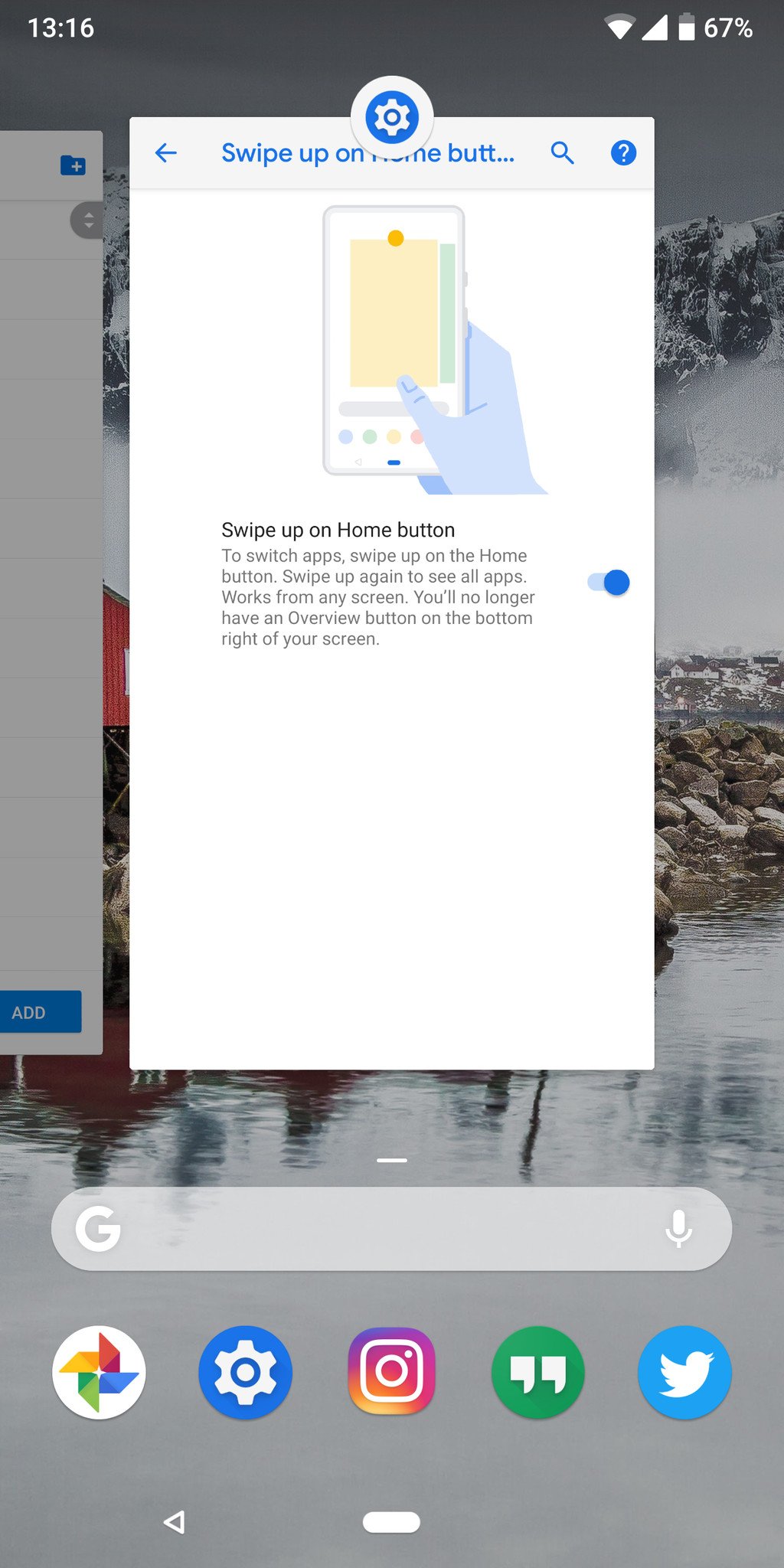
- Tap on Swipe up on home button.
-
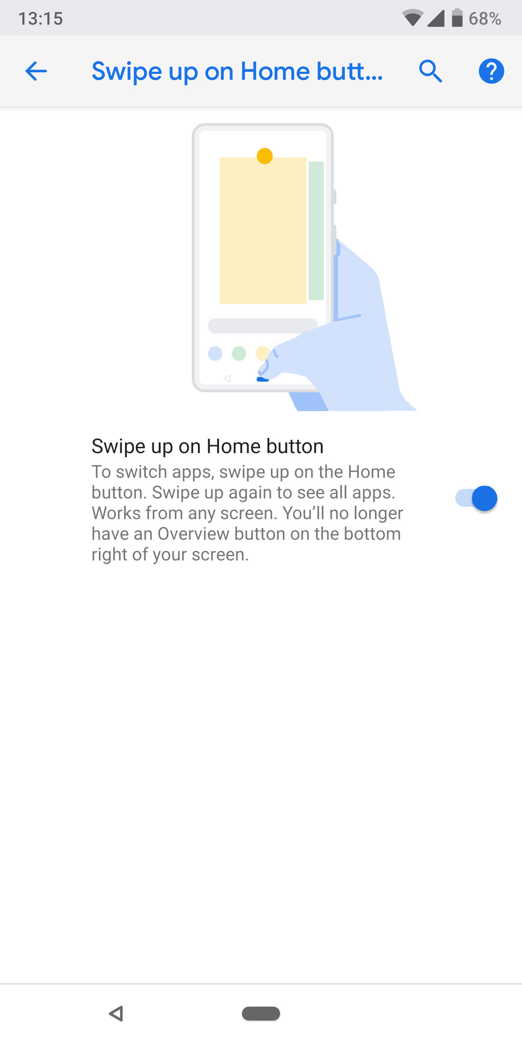
Toggle the switch to on — you'll notice the navigation buttons change immediately.
Aside from the oddly named and placed settings, that's a pretty simple process.
So, now you need to know how to actually use these gestures. Here's a quick rundown of how the gesture system works:
- You still tap the new elongated "home" button to go home at any time, that doesn't change.
- When you're in an app or view that can use a back button, the back button will appear to the left of the home button where you're used to seeing it.
- Swipe up on the home button and continue swiping to open the app drawer.
- Alternatively, swipe up on the home button and swipe up again to open the app drawer.
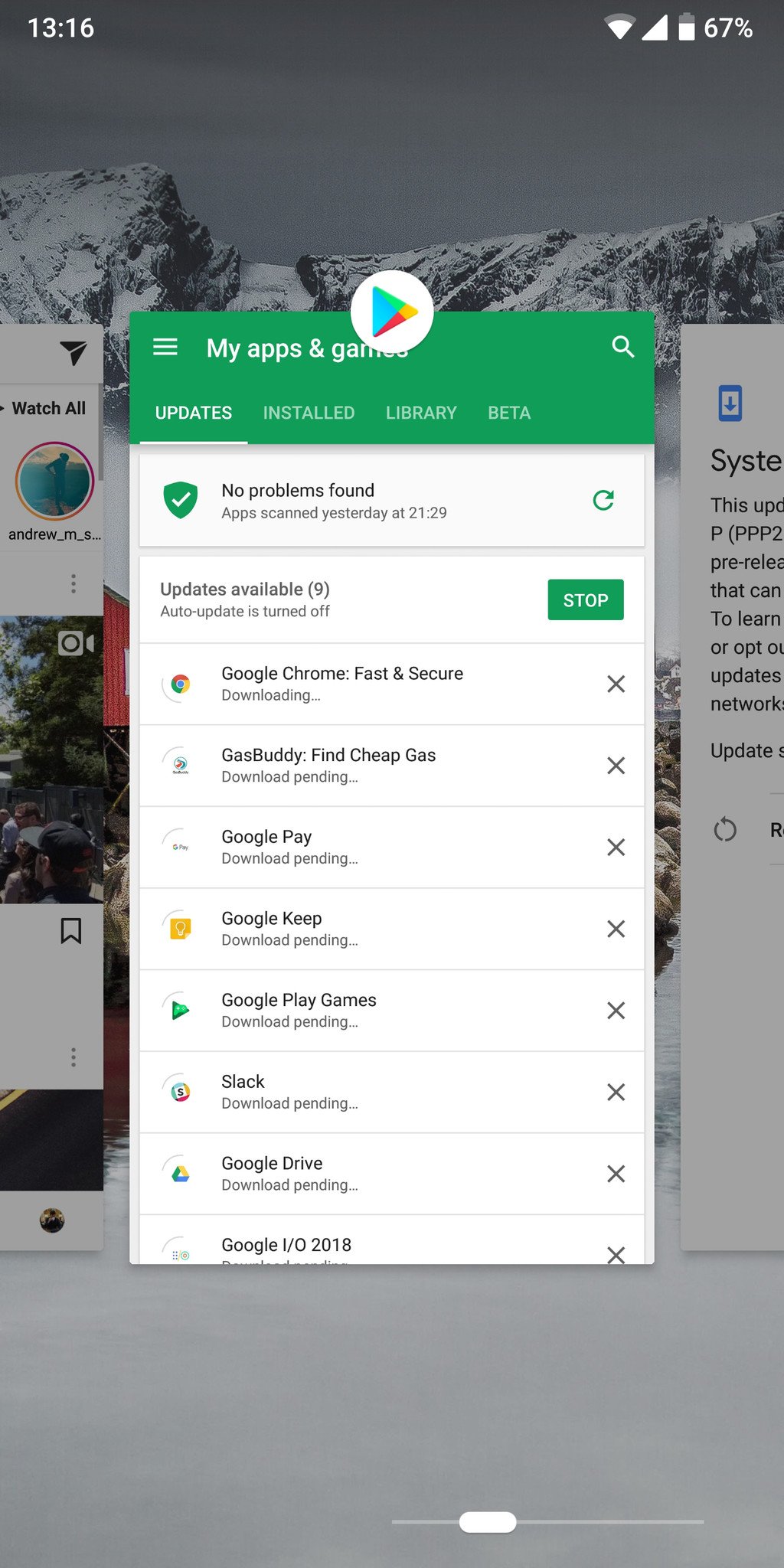
- Swipe up on the home button to enter the multitasking view.
- Swipe left and right to move the list, and tap to select apps.
- Swipe up to remove apps from the list.
- Press and hold on the app icon at the top to enter "split screen" view.
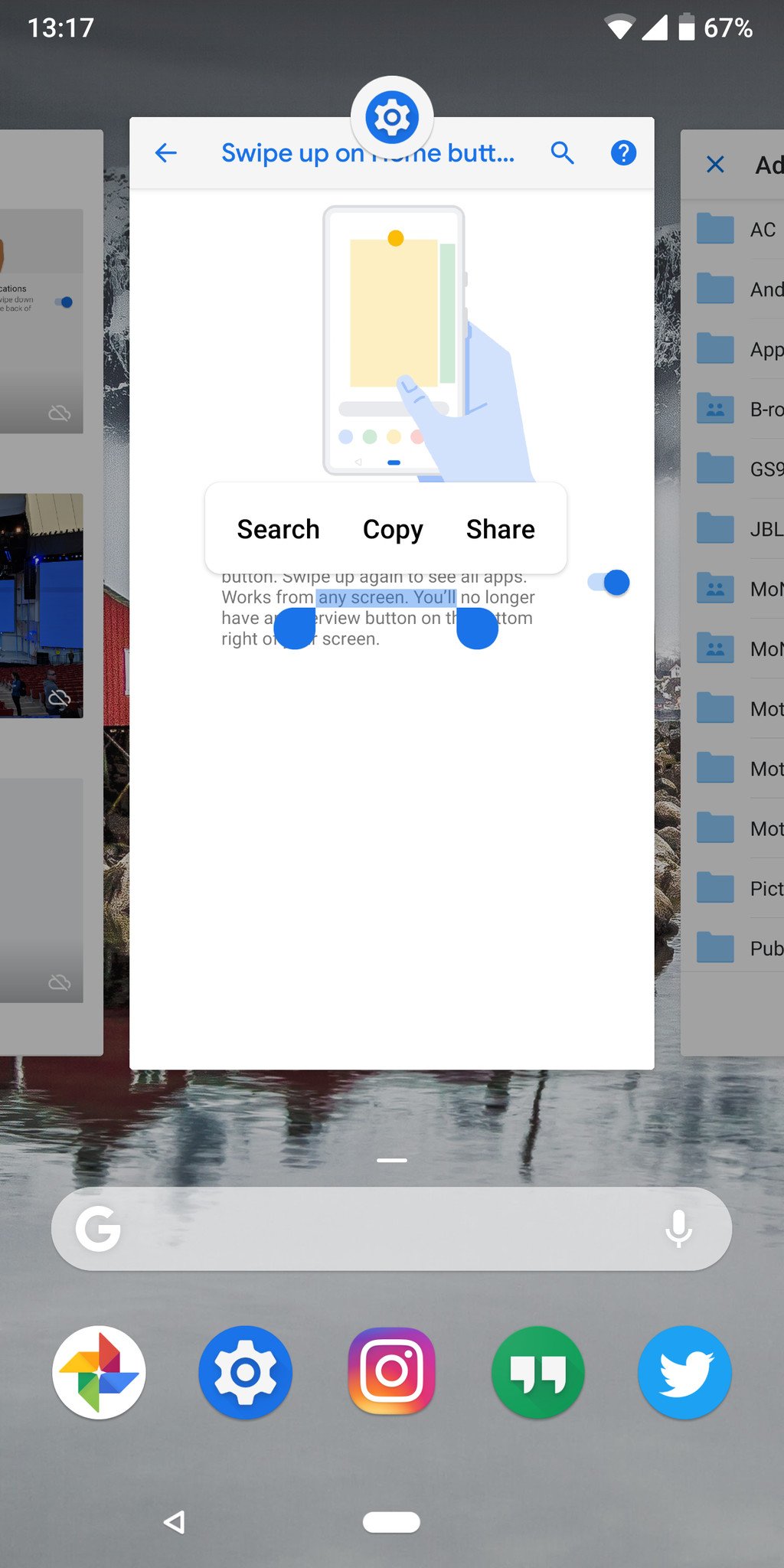
- Apps in this view are "live" — you can select, copy and paste text while in the multitasking view.
- Swipe right on home button and hold to scroll slowly between apps — release to open the center app.
-
Swipe right on home button quickly and release to just switch to the previous app — analogous to a double tap on recents currently.
This is a pretty considerable change to the way you interact with an Android phone, but I feel it's intuitive and more directly interactive in a way that the static buttons weren't. This change also affords Google the opportunity to dynamically adjust the buttons to the context of what the phone is doing, opening up even more possibilities going forward.
Tidak ada komentar:
Posting Komentar