There's also a new dark theme and improved screen compatibility.

Android Auto, Google's version of Android that's designed for use in the car, is getting a big facelift just in time for Google I/O. Just a day before the opening keynote of the annual developer conference, Google's unveiled a massive redesign for Android Auto that aims to make the interface easier to use than ever before.
On that note, a big part of this is seen with the new navigation bar at the bottom of the UI. With this navigation bar, you can see ongoing turn-by-turn navigation directions, music/podcast controls, prompt the Google Assistant, and access your notifications. The navigation bar was previously quite static, but it now adapts and reacts based on what you're doing.

Speaking of notifications, these are no longer limited to your Android Auto home screen. Instead, Google's created a brand new page through which you can access and interact with them at any time. With notifications no longer on the home screen, this has been redesigned into a simple app launcher which should hopefully make launching a specific app considerably faster than before.

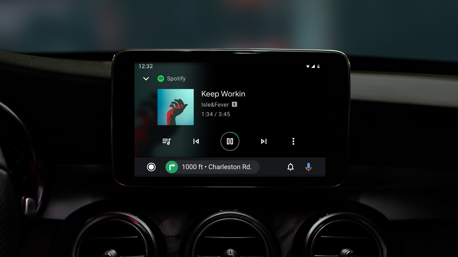
As for Android Auto's aesthetics, there's also a revamped color palette that consists of a dark theme throughout along with colorful accents and a font that's easier to read. Similarly, Google's made sure that Android Auto can properly adapt to infotainment screens of all sizes — even ones that are particularly wide.
The new Android Auto interface is rolling out to users "this summer", so we'll be sure to keep an eye out for it and let you know when it does finally arrive.
Tidak ada komentar:
Posting Komentar